Project Overview
I needed a portfolio project, and as a longtime Larry David fan I went looking for one in Curb Your Enthusiasm.
During the Seinfeld reunion season of Curb Your Enthusiasm, George Costanza pitches his million dollar idea: an app called the iToilet. In Jerry's wise words, the iToilet is "an iPhone application that leads via your GPS to the nearest acceptable toilet wherever you are in the world."
The scene is a joke, but the product underneath it is real. So I asked the obvious follow-up: what would this app look like during the COVID-19 pandemic?
Goals & Objectives
Get a user from opening the app to a mapped restroom in two steps, using interface patterns they already know. When someone opens a restroom finder, they are rarely browsing; fast and familiar beats clever.
Design Process
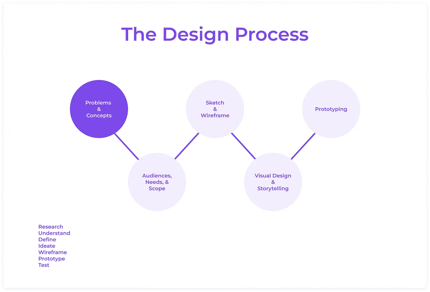
An app you open while urgently needing a restroom has a different bar than most apps. So before sketching anything, I researched who those users actually are and what they bring to the moment: their goals, needs, motivations, and frustrations.
Understanding the Users
What are the insights I can gather?
Preliminary research showed the market is niche on paper and large in practice. The people who plan their days around restroom access include those with health conditions (Irritable Bowel Syndrome, Crohn's Disease, Urinary Tract Infections, Prostate Cancer), people in on-the-go careers (delivery bikers, postal workers, Uber drivers), pregnant women, and families with small children.
About 12% of US adults, roughly 39 million people, live with irritable bowel syndrome (NIDDK)
So this is not a mass-market app, and it does not need to be. The niche is tens of millions of people, nobody was serving them well, and they share one requirement above all others: speed. When you need this app, you really need it.
Persona Development
I created two distinct personas to keep two very different kinds of need in front of me while designing, instead of one blurred "average user" that fits no one.
Persona 1: Amanda - Mother of Three
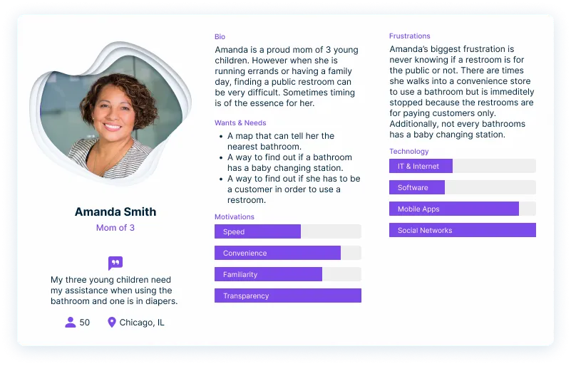
My first persona, Amanda, is a mother of three young children. Parents take their kids into the restroom with them, so a restroom with multiple toilets and a baby changing station isn't a nice-to-have for her, it's the minimum.
Any parent running errands with young kids is quietly scoping for restrooms the whole time: an accident, a diaper change, or a 2-year-old who cannot "hold it."
Amanda's biggest frustration is twofold: finding a restroom that fits her needs at the exact moment she or her kids need it, and finding one she can use without having to be a patron or employee of the establishment. iToilet answers both. She can filter by the number of toilets, require a baby changing station, and see up front whether she can walk in without buying anything.
Persona 2: Brianna - Postal Worker with IBS
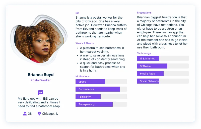
My second persona, Brianna, is a postal worker for the city of Chicago. Like roughly 39 million other Americans, Brianna has IBS, and her job keeps her on the move all day with no fixed restroom nearby.
IBS flare-ups are unpredictable, and Brianna's job is measured by how efficiently she delivers her routes. A flare-up already slows her down; a flare-up with no idea where the nearest restroom is can wreck the day.
For Brianna, iToilet is less a convenience than a buffer: a fast answer that keeps a flare-up from costing her a workday.
The Game Plan
The personas pointed to three things the app had to get right:
A clean and intuitive user interface that abides by accessibility standards.
An easy way to quickly filter your restroom criteria.
A simple way to save restrooms you trust.
Site Map
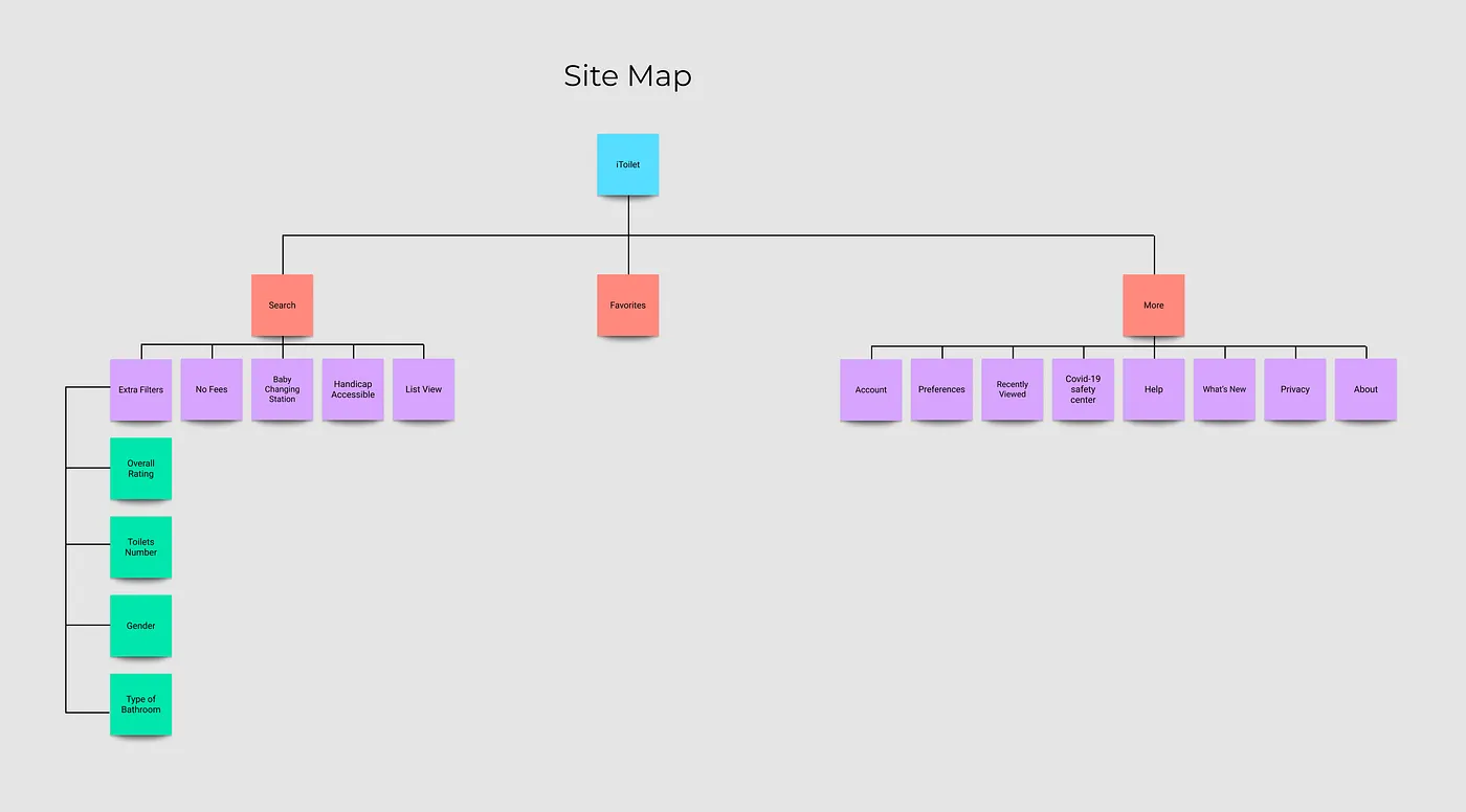
At first, I illustrated a sitemap focusing on the potential layout of the mobile app. After figuring out the three main criteria I noted above, I knew that the user's navigation should include the following: (1) a search "home screen," (2) a "favorite restroom" page, and (3) a "more" section where the user can edit their preferences and account information while also seeking out any guides they may need.
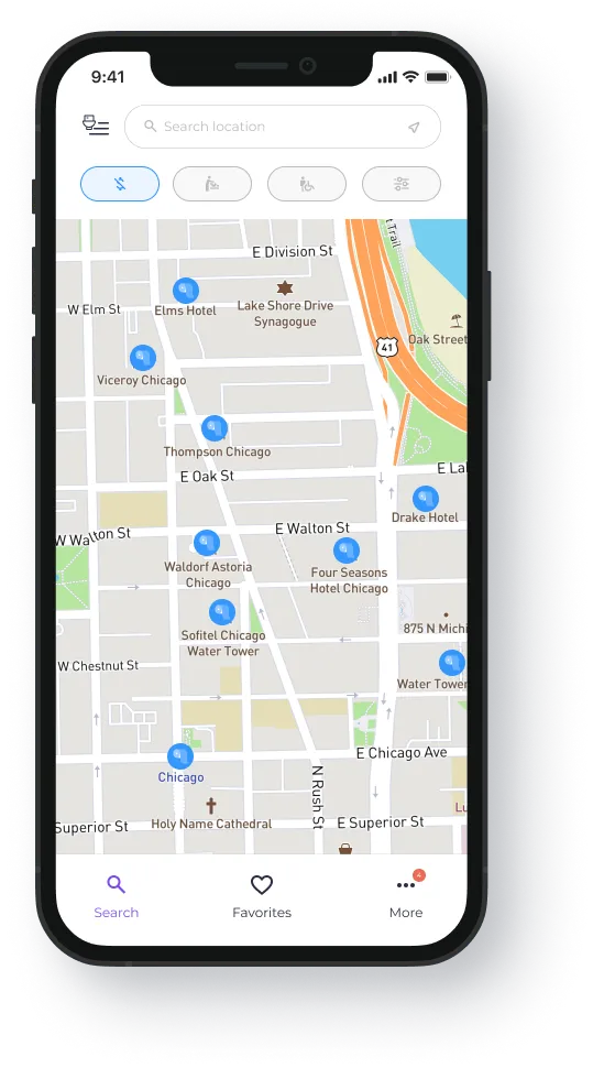
As for the search screen, I wanted three filters, each triggered by a single touch. The three my persona work pointed to: (a) no fees (no need to be a patron or paying customer), (b) family/baby changing stations, and (c) handicap accessible restrooms.
User Flow
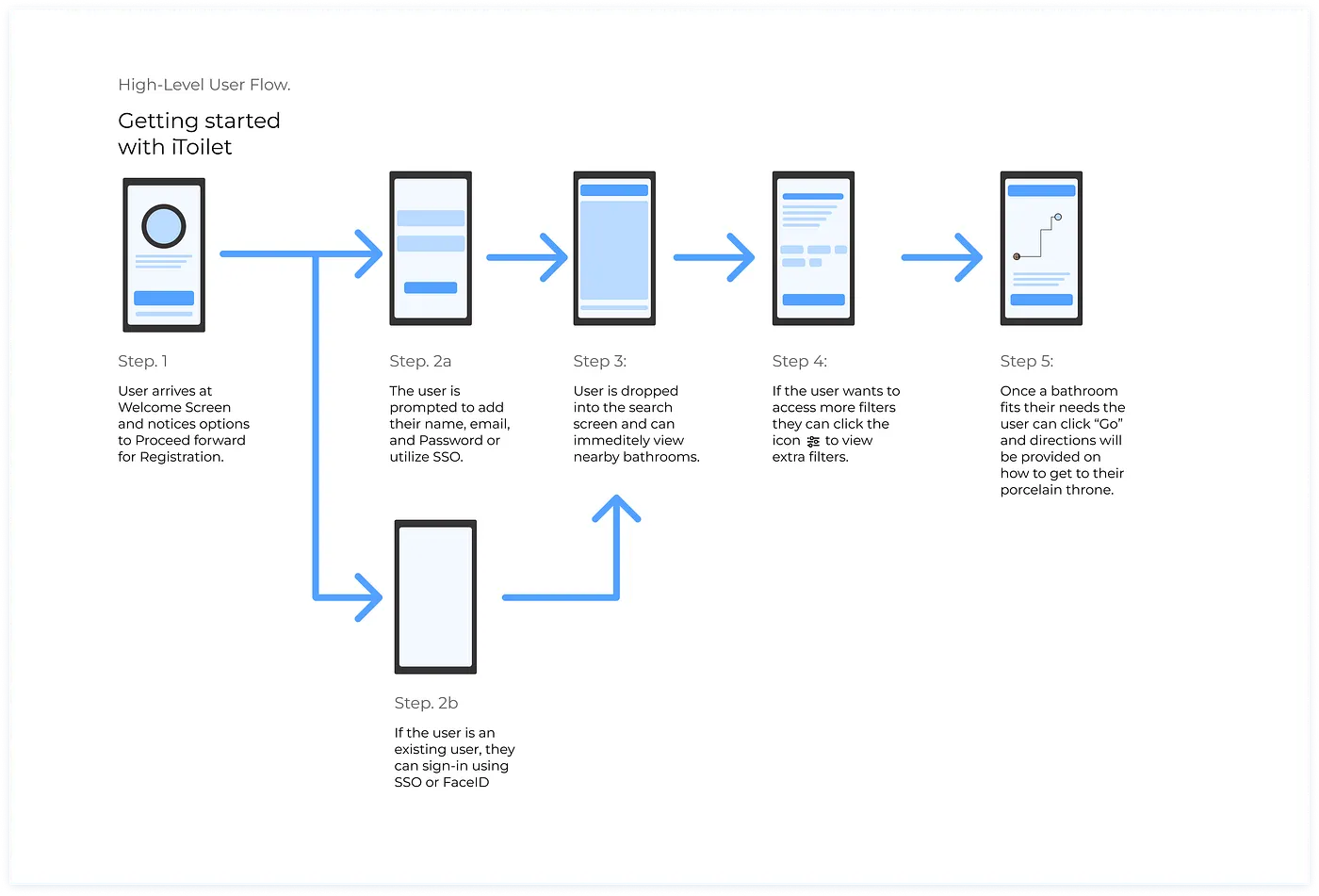
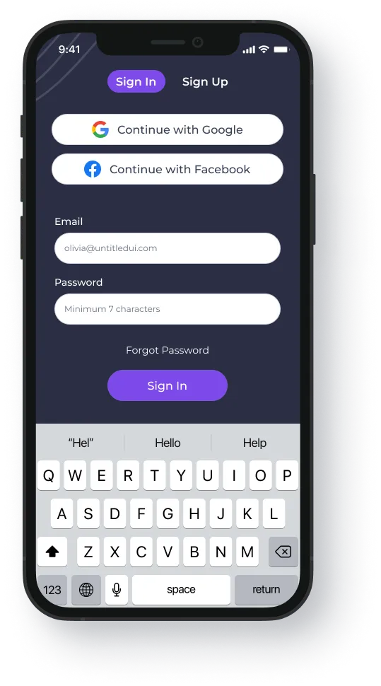
If onboarding stalls, nothing downstream matters. In 2018, Localytics found that 21% of users abandon an app after one use. So I set a hard ceiling: a new user should be inside iToilet within two steps of opening it. That meant leading with single sign-on. I chose Google and Facebook because that's where the accounts already are: Google Search has over 4 billion users worldwide, and Facebook has nearly 3 billion.
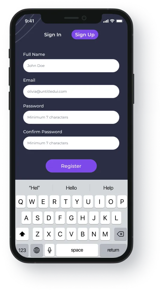
Not everyone has those accounts, and plenty of people would rather not sign into a toilet app with their Facebook login. Fair. The fallback is plain email: full name, email address, and a password.
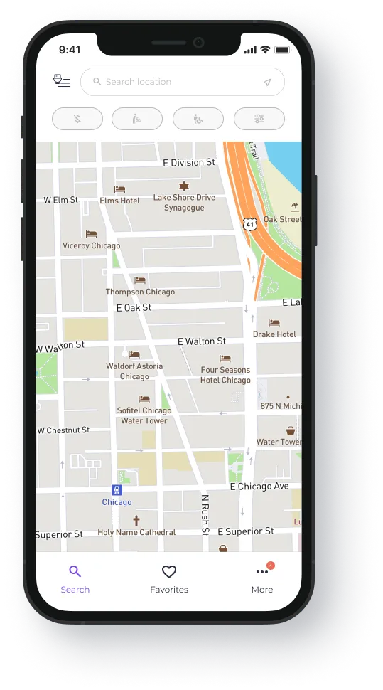
Once the account exists, the user lands directly on the home interface: nearby restrooms mapped around their location, each showing its distance. Tapping one brings up a photo of the restroom, its star rating, address, distance, and which features it has (no fees, handicap accessible, baby changing station). Find one that works, tap a button, and iToilet provides directions.
Paper Prototypes
Every screen got the same test: can someone who is uncomfortable, distracted, and in a hurry use it without thinking? That ruled out anything novel. The patterns below are deliberately borrowed from apps people already use every day, because the moment of need is the wrong time to teach someone a new interface.
Splash / Welcome Screen
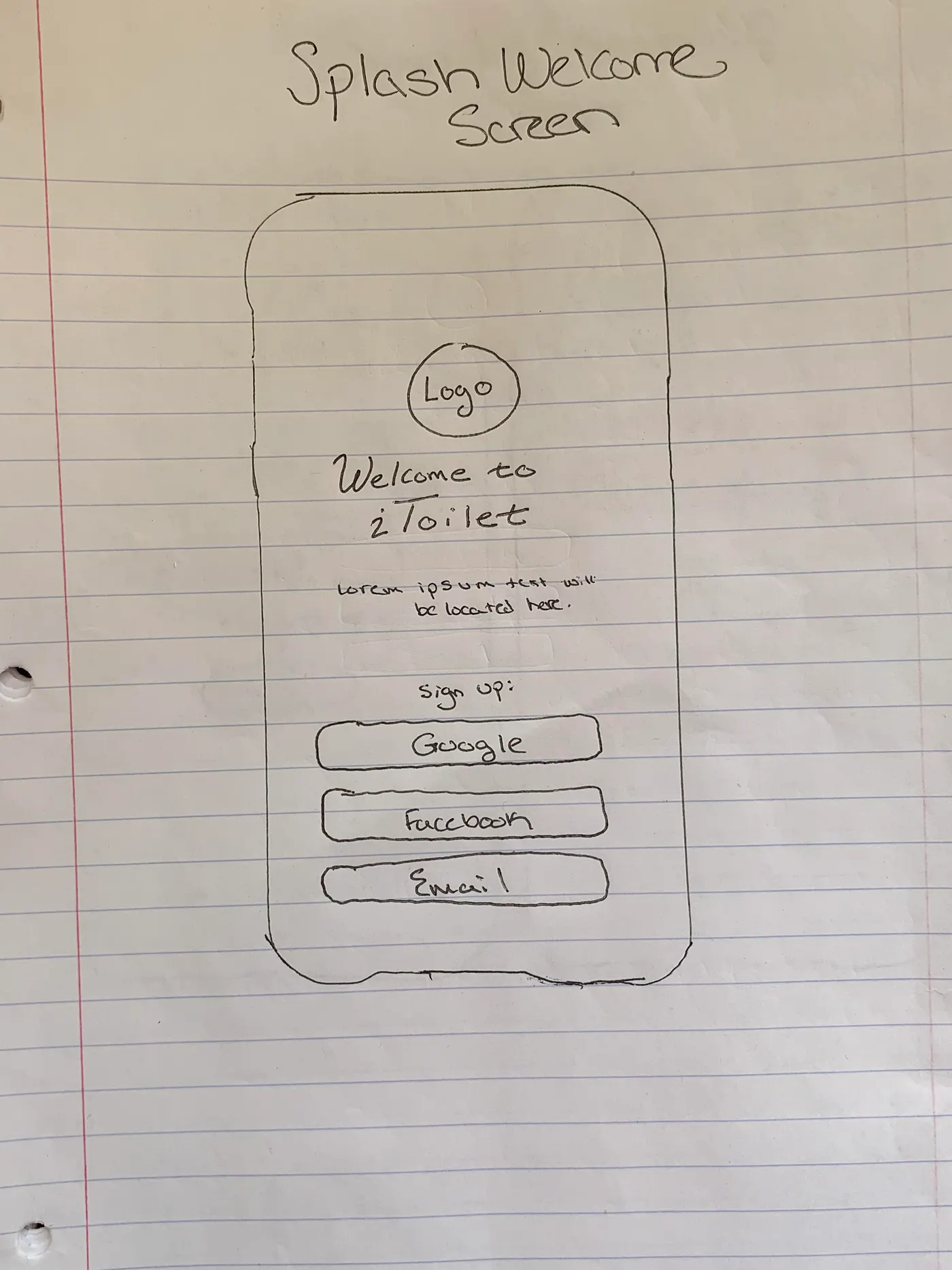
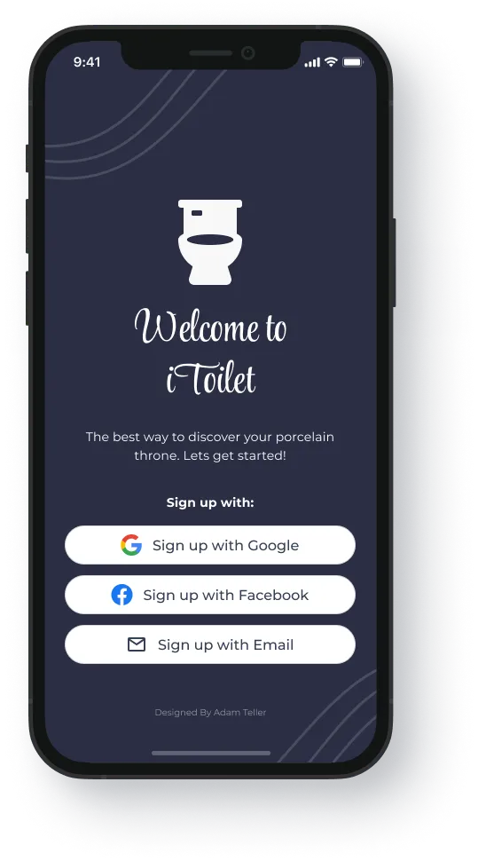
Jakob's Law says users expect your app to work like every other app they already know, and Hick's Law says decision time grows with the number and complexity of choices. The welcome screen takes both literally: the Google and Facebook sign-in buttons users already recognize, a simple layout, and nothing to puzzle over.
Sign In / Sign Up Screen
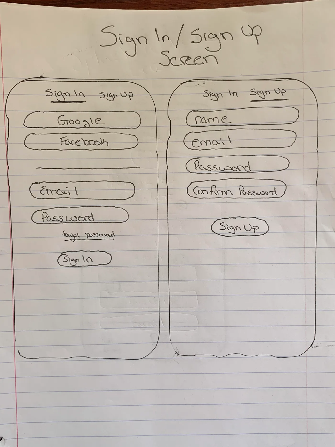
The sign-in and sign-up flow follows the same conventions as the well-known platforms users already trust (Jakob's Law again). A user can toggle between signing in and registering at any point, and tapping the "email" option moves them down to the name, email, password, and confirm-password fields.
Search: Map View
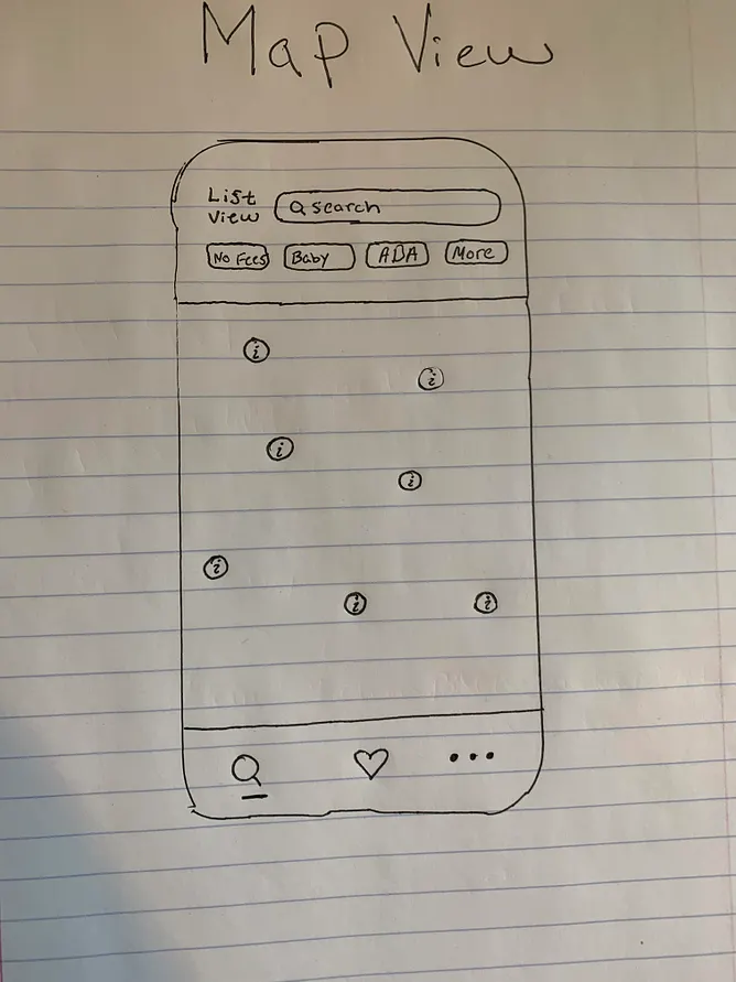
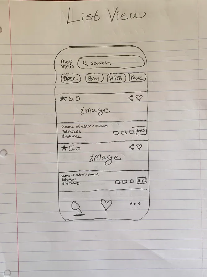
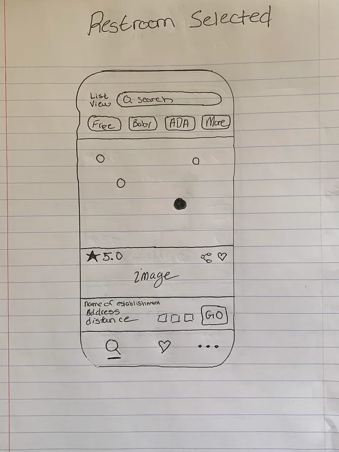
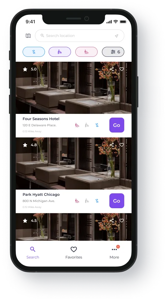
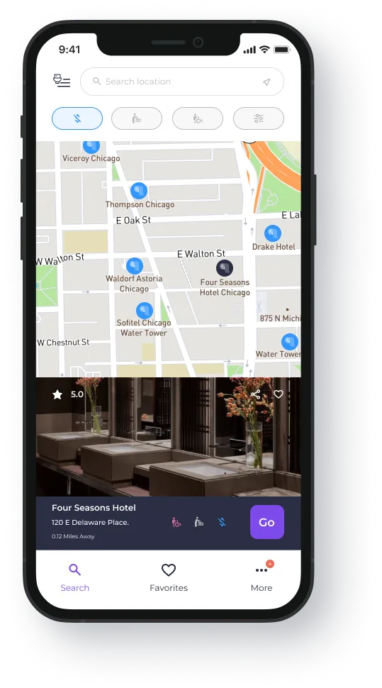
I wanted the search functionality to be easy to discern. Specifically, I wanted the user to have the ability to filter restrooms with a single touch (No Fees, Baby Changing Station, Handicap Accessible).
The footer navigation should follow Hick's Law and not be overly complex.
Each user has different preferences. I wanted to find a way to merge those preferences by providing the user with a way to search nearby restrooms via a list view or map view.
The same information displayed within the map view when a user selects a restroom will be displayed within the list view. Similarly, a user wanting to view restrooms from a list view can filter between restrooms just like they would in the map view.
When clicking on a specific restroom and viewing its information, the user will be able to see the following: an image of the restroom; its star rating; whether there is the ability to share a restroom; the name of the establishment where the restroom is; its address; the user's distance from the restroom; whether the restroom contains any filters; and an option for directions to the restroom.
Directions to Restroom
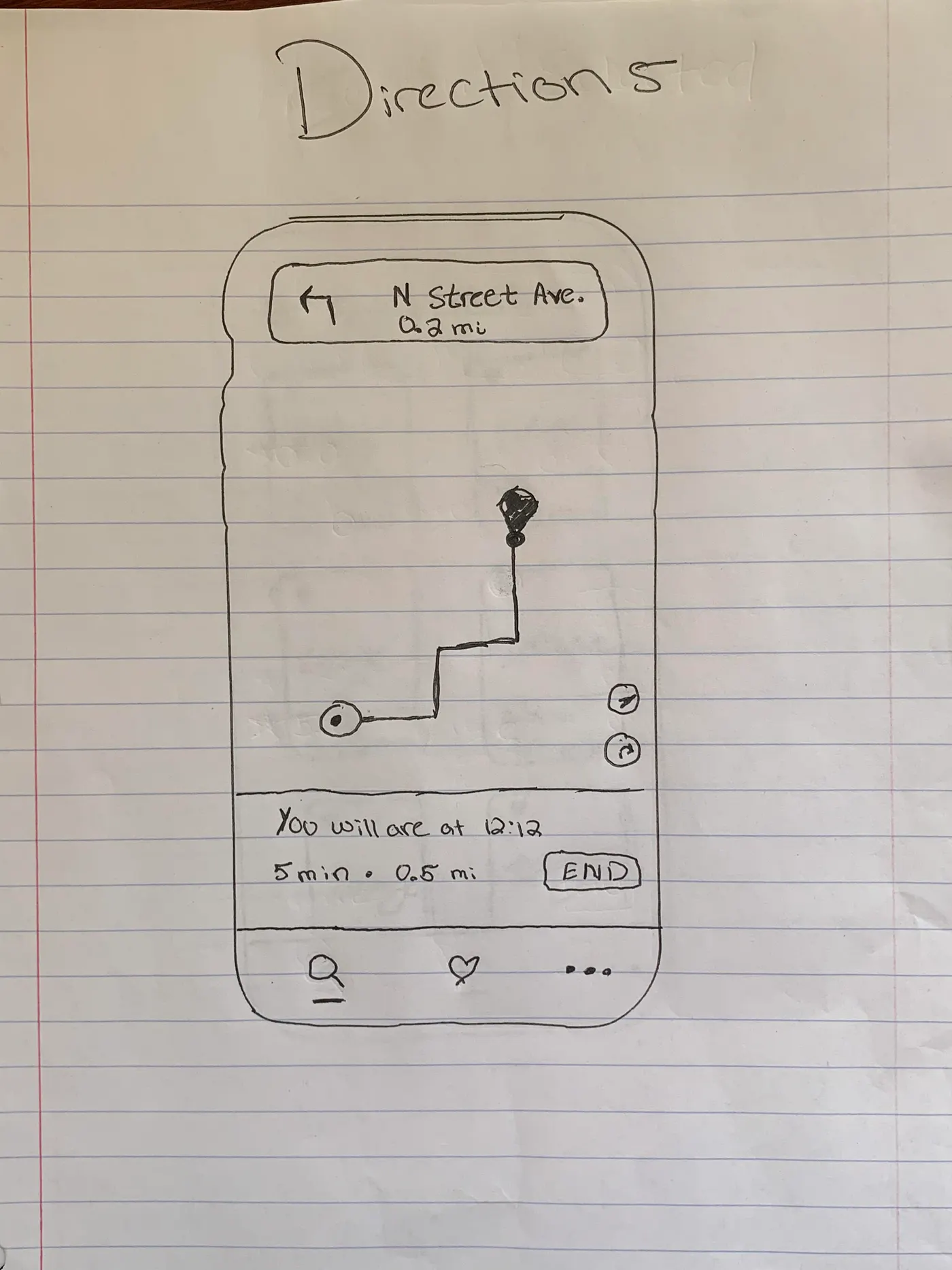
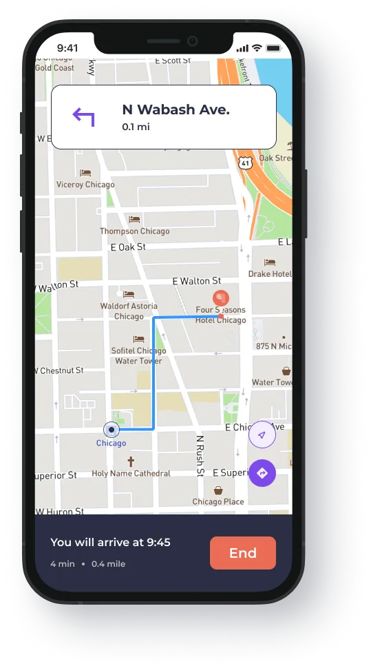
Directions work the way they do in every map app you have ever used, on purpose. Nobody should be learning a new navigation pattern while looking for a restroom.
When a restroom has been selected, a user will be presented with information of the expected time they should arrive, total time, and how far away the restroom is from their current location.
At the very top, specific directions will be displayed such as "turn left in 0.2 miles" with street names.
If a user needs to recenter their position or view a list view of their directions, those capabilities are featured on the right corner and are easy to click.
Favorite Restrooms
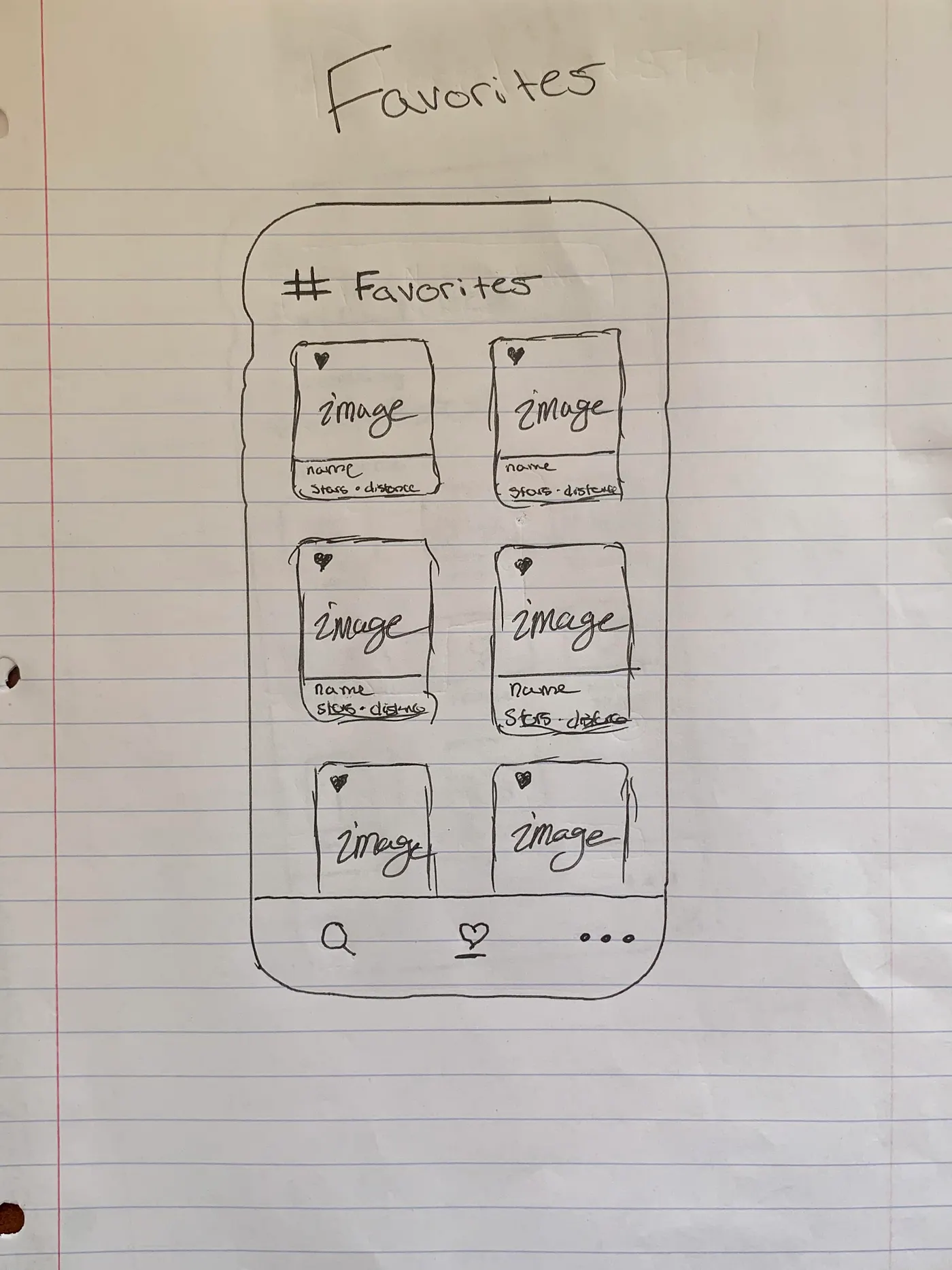
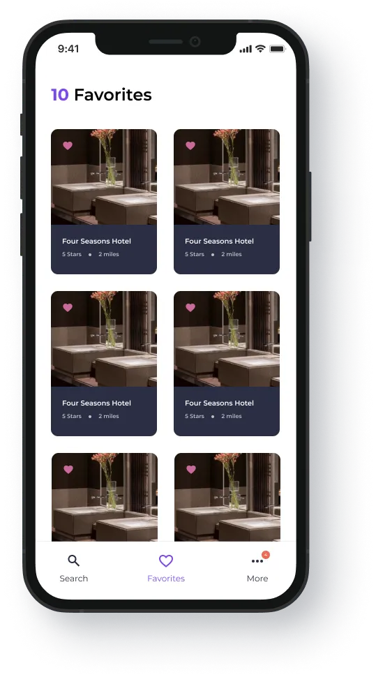
Whenever a user taps the heart icon, that "hearted" restroom can be found in the favorites section of the app.
At the very top, a user will be able to see the exact number of favorite restrooms they have added to their list.
A user can deselect a favorite restroom by tapping on the heart icon at any time.
Extra Filters
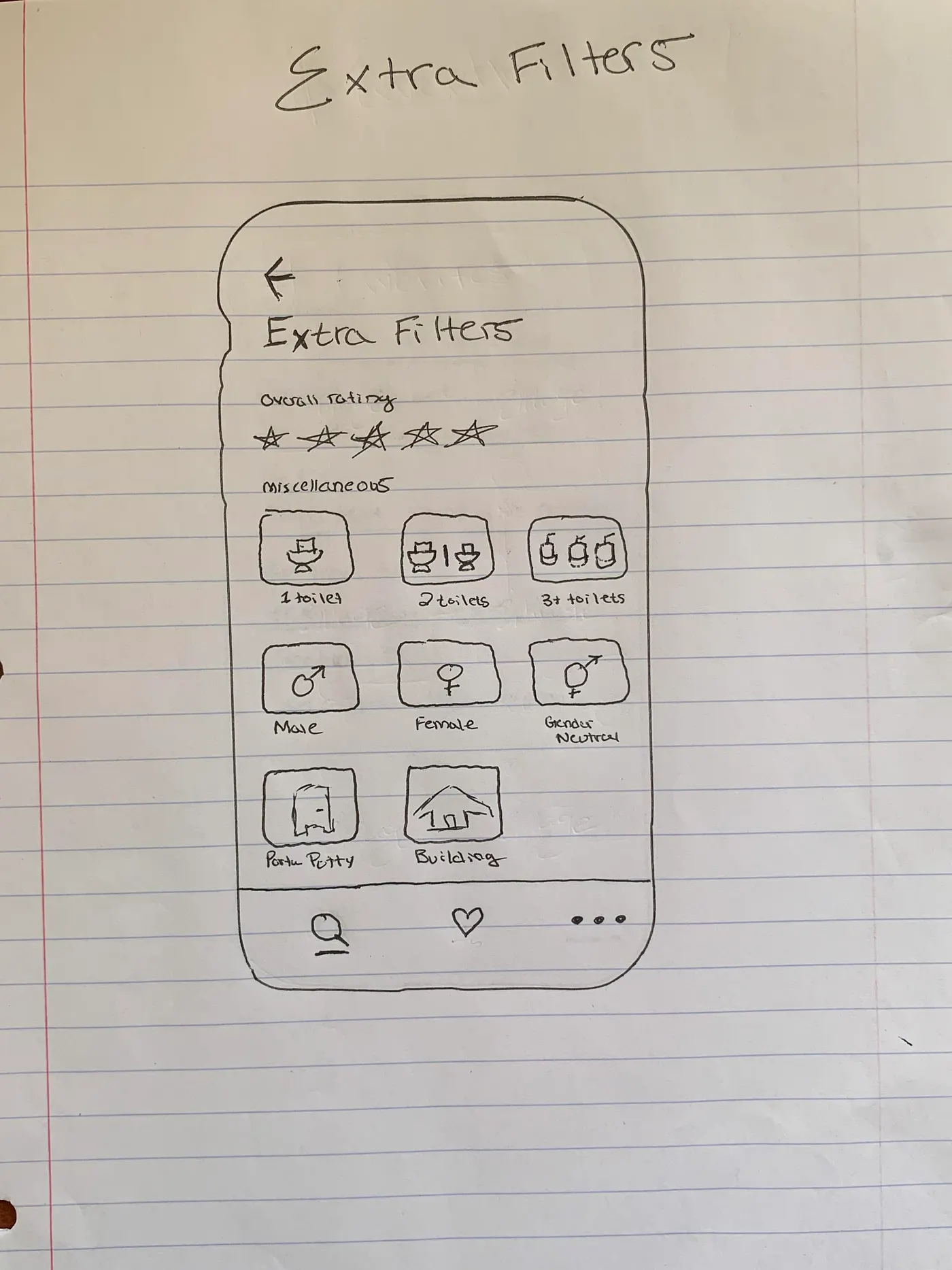
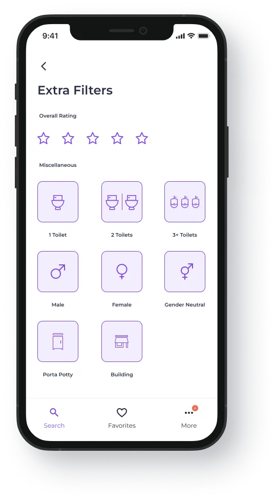
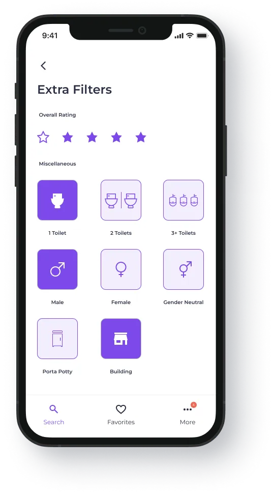
Law of Proximity states, "Objects that are near, or proximate to each other, tend to be grouped together."
To separate the overall rating filter from the miscellaneous filters, I used the Law of Common Region.
Law of Common Region states, "Elements tend to be perceived into groups if they are sharing an area with a clearly defined boundary."
Nearly 70% of Americans report an unpleasant experience using a public restroom (Bradley Corporation's Healthy Handwashing Survey). A rating filter lets users skip the bad ones, which is most of the reason this app exists.
More Section
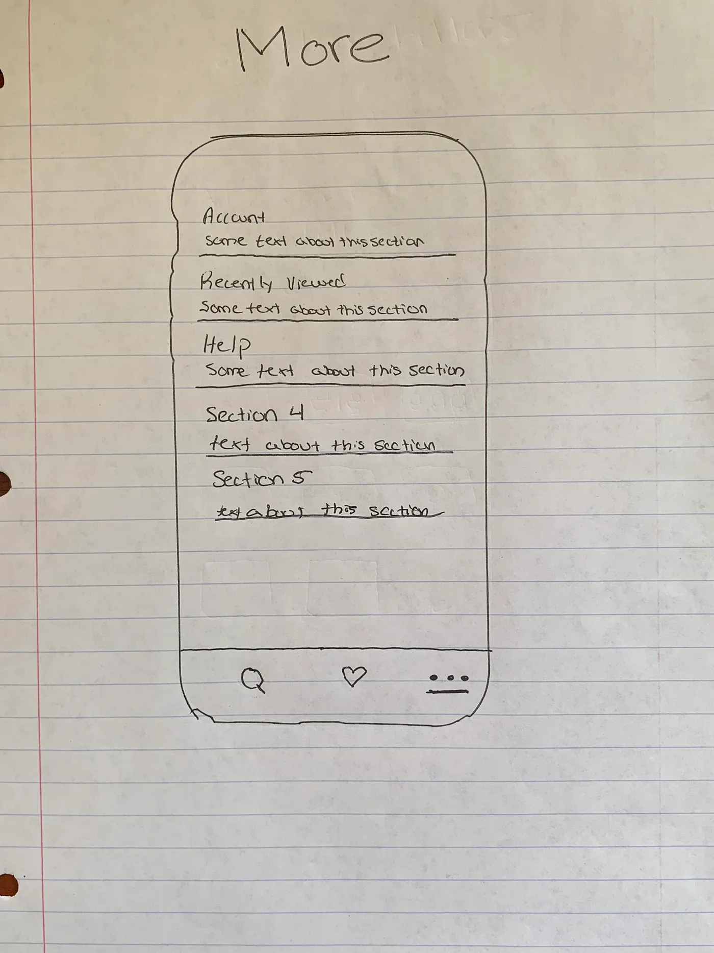
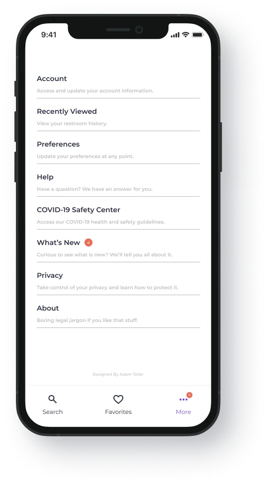
I laid this page out in a Z-pattern because a settings page should scan quickly, not impress anyone.
Here, the name of the section and a short description will be provided so the user has an idea of what purpose each specific section has.
In this area, the user will be able to edit personal preferences, account settings, notifications, COVID-19 information, and more.
Final Mockup
Hover over or tap on images to view details
Outcomes & Impact
iToilet is a concept, so the outcome is a validated direction rather than a shipped metric, but the research showed the need is real, large, and badly underserved.
Americans (12%) live with IBS, one of several large segments the app would serve
of Americans report an unpleasant public-restroom experience, the problem is near-universal
from secondary research and personas to a finished high-fidelity prototype
The result is a complete, accessibility-minded concept (from sitemap and user flow through to final high-fidelity mockups) built around speed and familiarity. The clear next step is moderated usability testing of the onboarding and search flows.
Key Decisions & Trade-offs
I committed to people with IBS/Crohn's, on-the-go workers, and parents of small kids. Narrower than a mass-market app, but a deep, urgent, and underserved need.
Amanda (a parent of three) and Brianna (a postal worker with IBS) kept the design honest to real, divergent needs instead of a blurred average that fits no one.
Three filters (no fees, baby-changing, handicap accessible) instead of an exhaustive list. Less coverage, but a single-touch decision that respects Hick's Law.
SSO and a minimal flow over a custom one (Jakob's Law), because ~21% of users abandon an app after a single use, so speed-to-value protects retention.
Moving Forward
This app is purely conceptual, and I want to be clear that I am in no way taking credit for, or attempting to steal, the brilliant Larry David's (George Costanza's) idea.
What surprised me most is that nothing like this exists at any real scale. Tens of millions of people plan their days around restroom access, and the app stores offer them almost nothing. The joke turned out to be a better product brief than most.
Originally published on Medium.