The short version
- I don't use one AI for everything. I treat the tools as a team of specialists and keep the judgment for myself.
- Gemini for wide research, Claude for synthesis, the design system, accessibility, and code. Different tools for different shapes of work.
- The design system runs on a two-layer token model with an automated Figma-to-code pipeline, so design and code never drift.
- I stopped writing one-off prompts and started building reusable skills, then moved from prompting to orchestration when I realized I'd become a human clipboard.
- The most important lesson: AI is confidently wrong often enough that the whole job is staying close enough to catch it. No tool caught my biggest mistake. Three users did.
Who this is for
The intro piece was the why. This is the how, and it's long on purpose.
If you're a product designer, a design engineer, or someone who lives where design meets build, you've been told a hundred times this year that AI changes everything. What's harder to find is someone showing their actual work: which tool did which job, what broke, and where the AI quietly fell short and I had to step back in. That's this.
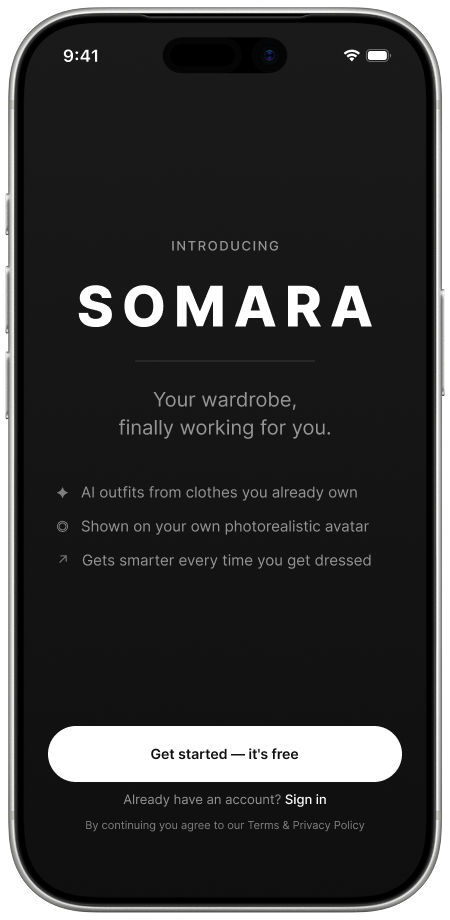
Quick orientation. Somara is a conceptual iOS app that helps people get more out of the clothes they already own. You bring in your wardrobe, an AI stylist builds outfits from what you have, and shows them on a photorealistic version of you. I'm building it with my cousin, Joey Schroeder. It's early, and it's a portfolio project, not a funded startup. Everything below is how I actually built it.
The business case and the goal
The often-cited 80/20 wardrobe rule says we wear about 20% of what we own. The whole product is a bet on the other 80%.
That unworn 80% is the opportunity: a problem people feel constantly, attached to an emotion no product currently owns. When I went looking, the market was crowded with wardrobe apps that restate the problem instead of solving it. They help you catalog what you own, then hand the hard part, the styling decision, right back to you. Human-stylist marketplaces solve that, but on a timescale of days and a price that doesn't fit a daily need. The well-funded AI players are mostly pointed at selling you the next thing, which my research said is the fastest way to lose this user.
So the goal is narrow and a little stubborn: don't build another feed, don't build a store with styling bolted on. Build the thing people actually asked for (help using what they already own) and make that the entire product. Shopping comes second, and only when there's a real gap.
Styling before shopping. That one decision is the spine everything else hangs from.
How I work with AI now
I stopped looking for one AI that does everything. There isn't one. I treat the tools like a team of specialists I didn't have to hire.
One is my researcher, one my synthesizer and writing partner, one ideates visuals, one writes production code. My role changed accordingly: I'm not typing every line anymore, I'm the person who knows what good looks like, briefs each specialist, checks the work, and stitches it together. The tools do the heavy lifting. The judgment stays mine.
That phrase is doing real work. The strong version of this is human-in-the-loop: AI accelerates the task, but review and the final call stay with a person. The failure mode is the opposite, where the output is fast and fluent and subtly wrong, and you ship it because it sounded right.
There's a bigger shift underneath, and it took me a while to feel it. Early on, the skill that mattered was writing a good prompt. Increasingly, the skill is orchestration: deciding which specialist handles which step, in what order, and how the outputs hand off. More on that below, because there was a specific moment it clicked.

Research and synthesis
I gave the wide research to Gemini and the deep research to Claude. That split is the team idea in practice.
Gemini for breadth. Market size, where the category is heading, who's funding what, what the existing apps actually do. It's strong at sweeping a lot of ground fast and organizing it, so I used it for the industry pass and again for data synthesis. When people ask why I don't just use one model, this is the honest answer: I reach for different tools for different shapes of work.
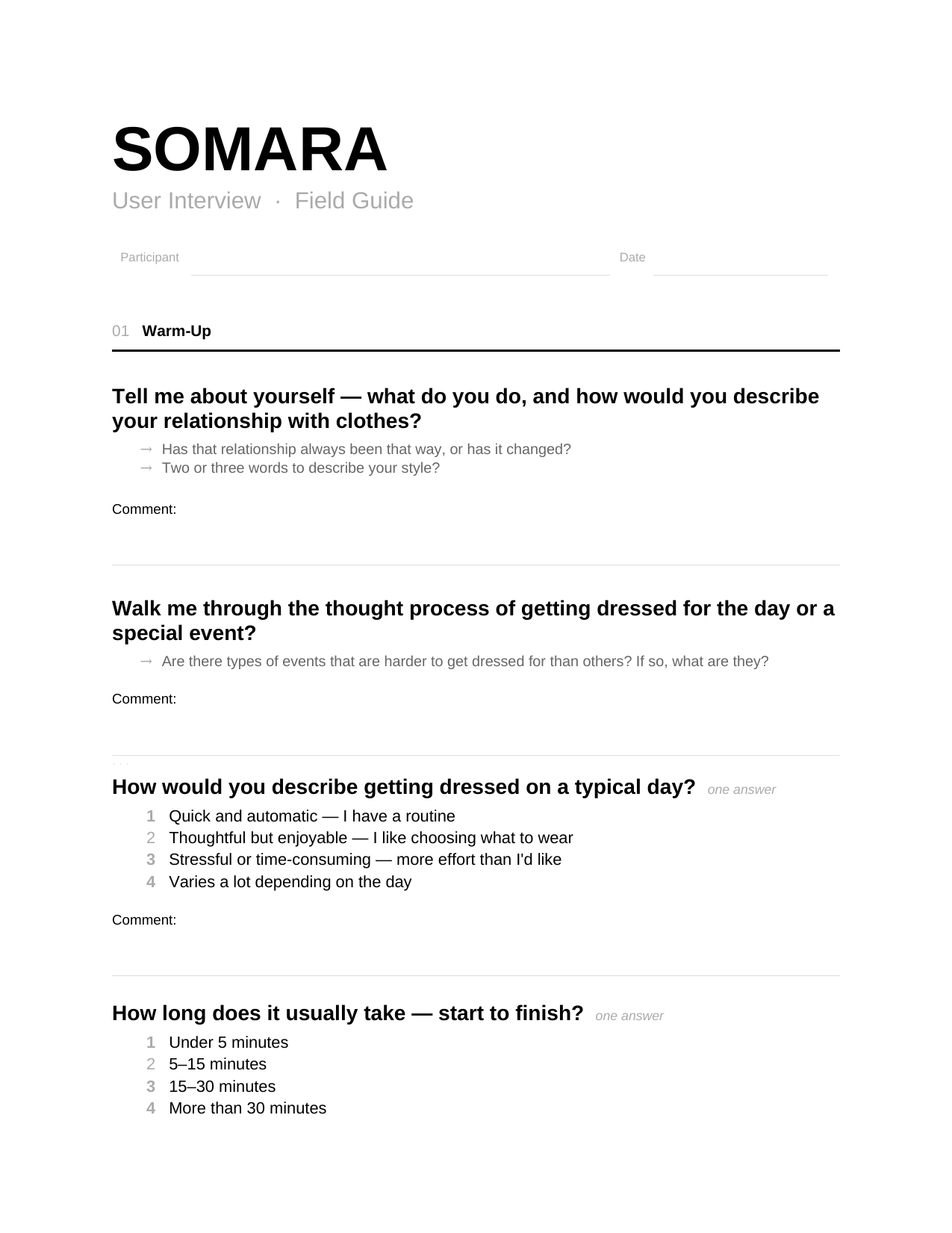
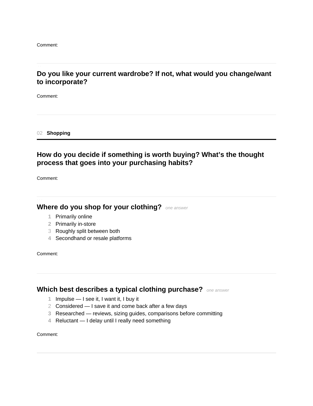
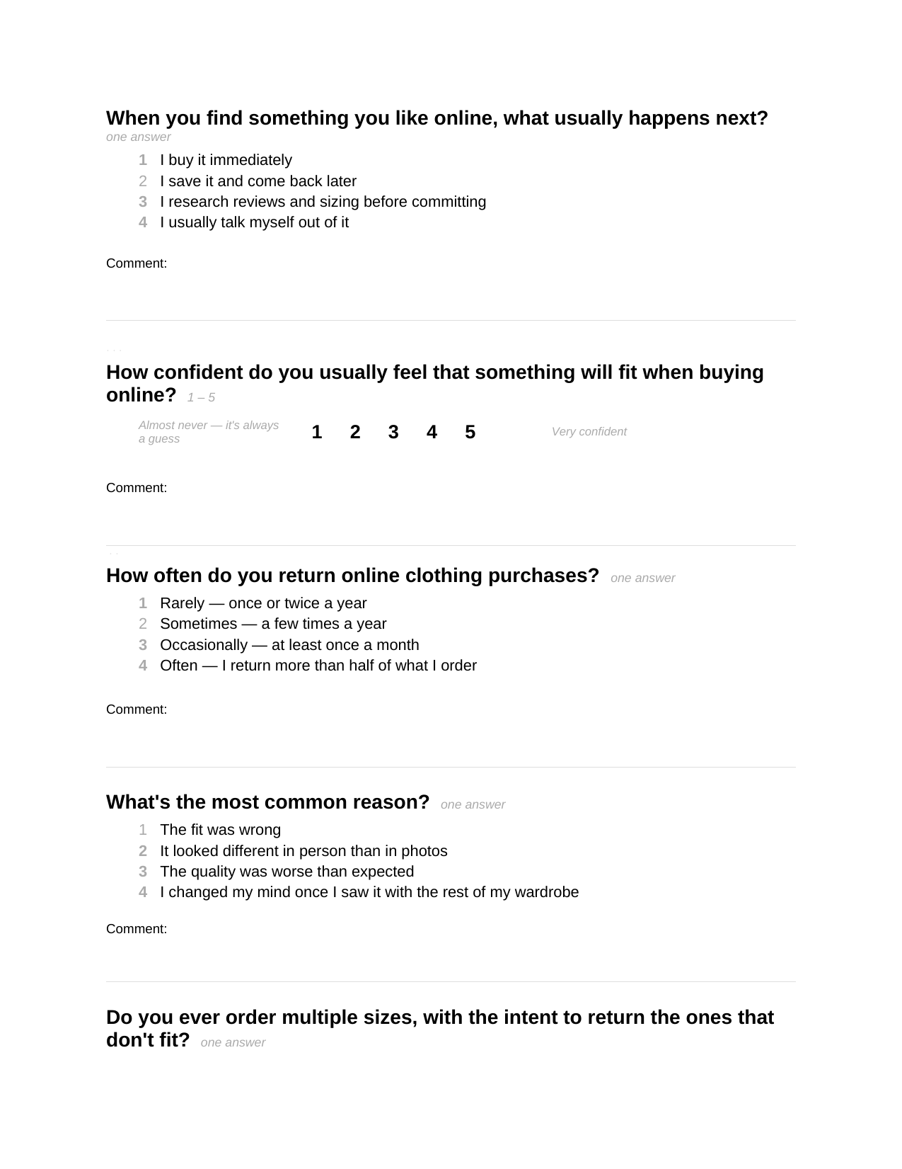
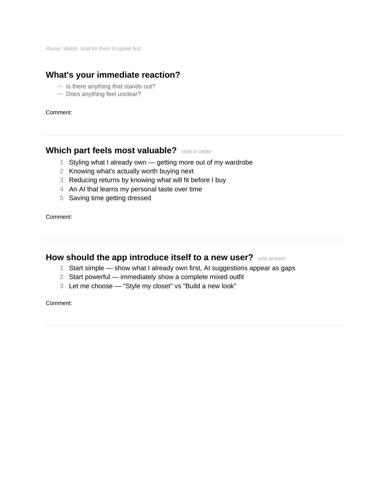
Claude for the careful parts. The interview guide was one of those. Before talking to anyone, I needed a guide that wouldn't lead the witness, which is harder than it sounds. We built a 60-to-75-minute conversational guide in eight sections, structured so I wouldn't pitch the idea until the very end, with reminders to let silence sit, because the real answer often lives in five seconds of quiet.
Then the unglamorous work: cleaning each recording into a transcript and synthesizing it into a structured field guide. Doing that 18 times by hand would have buried me, so I built a repeatable process in Claude. The synthesis is where the insight lived.
A few findings did most of the work. “Nothing to wear” is almost never an empty-closet problem, it's a combination problem: people own the pieces and can't see how to combine them freshly. Styling what you own ranked as the number one user value, above shopping. And there was a near-universal trust red line: selling body data was a delete trigger for nearly everyone.
As Jac put it: “Just have something so obvious in front of me of everything I own, and just reiterate that I don't need to go buy something new.”
The most consistent finding was friction, and it hit harder because I felt it myself. I have a competitor's app downloaded that I haven't opened in four weeks, because of the dread of photographing my whole wardrobe. A participant, Len, actually tried that competitor and quit at the same wall. When the builder and the users hit the same wall, that wall is the product problem.

What the research told me about the users
There wasn't one user. There were segments, and the differences mattered more than the averages.
The one thing nearly everyone shared was the hard moment: occasions. Not the daily routine, which most people handle, but the dinner or date where you'll be seen and don't have an answer. Even people who rarely feel “nothing to wear” named occasions as the exception. That's the painkiller the whole app should lead with.
From there it splits. Inspiration-driven users (Dani, Jac) want to recreate a look from what they own. Utility-first users (Connor K, Megan) want a fast answer and nothing more. Gap-hunters (Connor B) really want to know what to buy next. Designing for the average of those people would have fit none of them.
Two specifics changed the product:
Avatar dignity: David, the most product-articulate participant, described his ideal app almost exactly as a video-game character creator, then added that the avatar should never appear in its underwear. The digital you deserves the same dignity as the real you. That's now a rule.
The trust line: because the app touches your body and your image, any whiff of selling that data ends the relationship, which turned privacy into a design requirement, not a footnote.

What Hooked taught me about the product
I read Hooked: How to Build Habit-Forming Products, and it became the backbone of the design anyway.
“Habit-forming” is the exact language behind the feeds my interviewees said they were tired of. But the book reframed it: a habit is simply a behavior gone automatic, and the question that matters is whether it serves the person. Eyal is blunt that these tools only earn the right to exist if they make lives better. I held onto that.
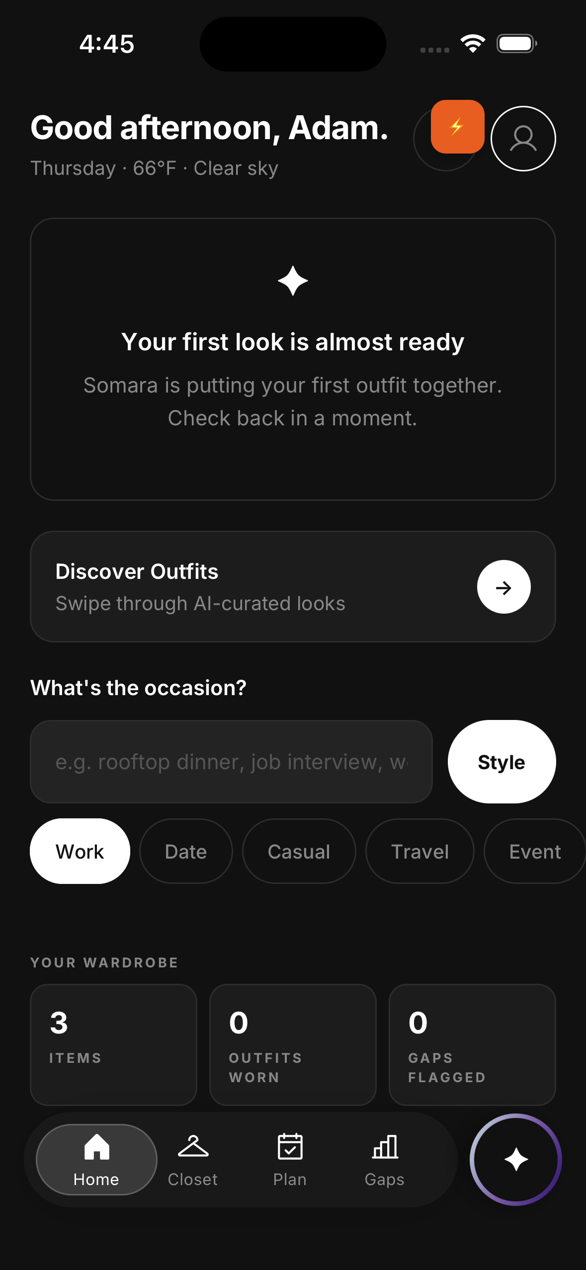
I mapped Somara onto Eyal's four-part loop without kidding myself. The trigger isn't a notification I invented, it's an emotion that already exists, the drop in confidence before you're seen. The action is as small as I could make it: open, say where you're going, done, under thirty seconds. The investment is the quiet engine: rate an outfit, log what you wore, add an item, and the next suggestion gets more like you. Eyal calls that stored value.
The reward deserves its own line, because it came straight from a participant. Instead of one “correct” outfit, Somara offers three: Safe, Frisky, Risky. You don't know which will feel right today, and that uncertainty is what makes opening the app feel alive instead of mechanical.
Steven, unprompted: “Three choices to see. Something safe and comfortable, a middle option in between, and one I'd never tried before. Safe, frisky, risky.”
I kept it to three on purpose. More options recreate the paralysis the app exists to cure, which is just Hick's Law. And I'll be straight about the uncomfortable part: the same mechanics that make a habit healthy can make one predatory, and the line between them is intent and honesty. I'm trying to build the kind of habit that gives something back, and mapping it in the open is part of how I stay honest about which side of that line I'm on.
The confidence dip before you're seen. An emotion that already exists, not a notification I invented.
From inspiration to a system
I used Lovable to get unstuck fast, then turned its output into a real system instead of treating it as the design.
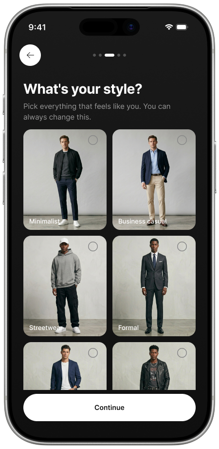
Staring at a blank canvas, the most valuable thing an AI design tool gives you is something to react to. Lovable got me from nothing to reactable screens in an afternoon. But I treated that as raw material: I extracted the designs with a prompt, pulled the pages apart, and re-engineered them into the start of a reusable system.
Then the move people are surprised by. Instead of redrawing in Figma by hand, I used an HTML-to-design plugin to pull the Lovable output straight into Figma as pixel-accurate wireframes. The point was honesty: the wireframes weren't an approximation of the build, they were the build rendered in Figma, so design and engineering started from the same artifact instead of two drifting interpretations.


Building it, and designing for accessibility
Accessibility isn't a compliance chore. It's whether the person you're asking to trust you can read the promise you made them.
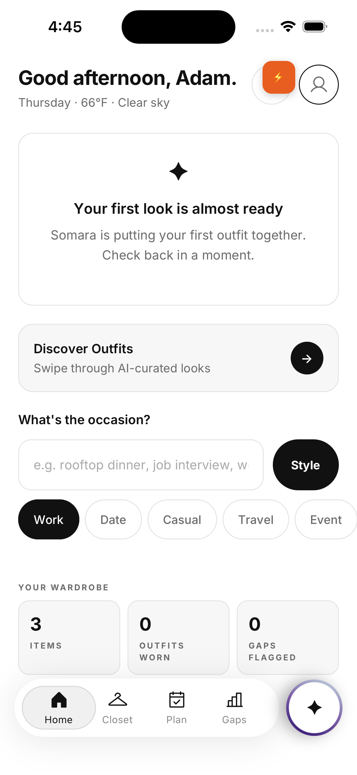
The app is React Native and Expo, written in Cursor. Because the tokens are the single source of truth, a screen asks for a color or spacing value by name and gets the right answer in light or dark mode. The build inherited the design instead of reinterpreting it.
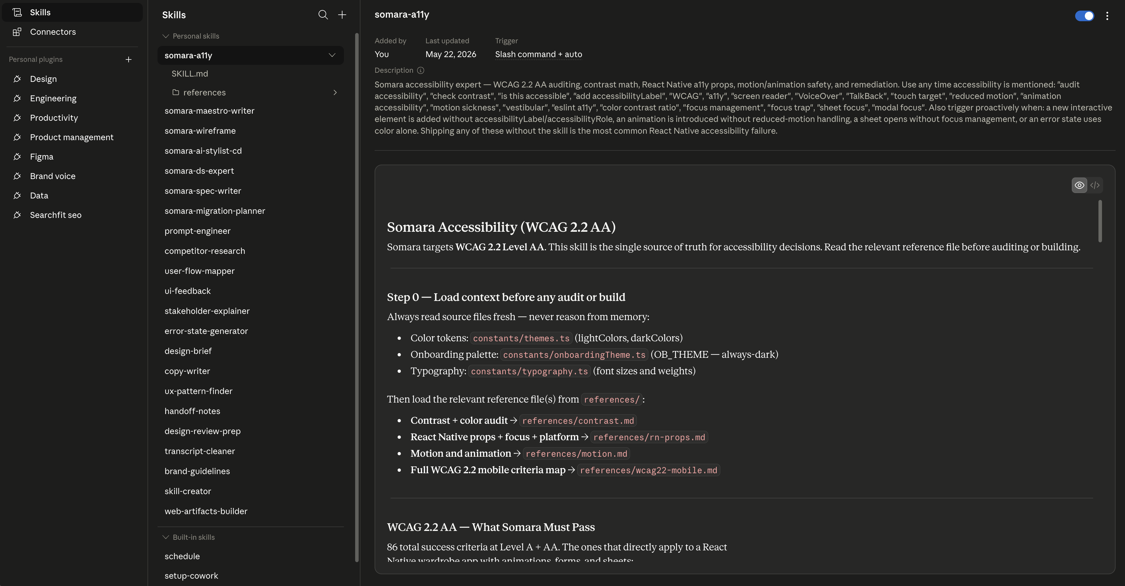
Accessibility is the part that meant the most to me, and a good example of what AI is genuinely great at. I ran a programmatic WCAG 2.1 AA audit with Claude Code, not a vibe check. Real contrast math against every token pair, screen, and component, each measured against the 4.5-to-1 threshold for readable text. This is exactly the work AI should do: exhaustive, rule-based, the kind of pass a tired human skips at 11pm.
It found real failures: placeholder text at less than half the required contrast, light-mode screens that had inherited dark-mode grays. And the one that stopped me cold: our own privacy promise, the line reading “never used for anything else,” was rendering at a contrast ratio of 2.6 to 1.
The single most important sentence in the app, the one that earns the trust the whole product depends on, was one of the hardest to read on the screen.
I fixed every failure. But fixing that one felt like the actual point.
Design iterations and usability testing
Three participants, three cities, one root cause: the app asked for investment before it delivered any value.
Watching the sessions, the pattern was unmistakable. Photograph your whole wardrobe, enter your size, meet your AI stylist, all before the app had shown a single useful outfit. People stalled at the upload screen or started to suspect the app was really there to advertise to them. The cruelest version: the sessions only got past onboarding because I was in the room guiding them.
I had built the loop backwards. Eyal is explicit that investment is supposed to follow the reward, not come before it.
The fix wasn't a feature, it was resequencing what already existed: deliver value first, even one outfit from three items, then ask for investment. The sessions also produced patterns that showed up independently across people, which is the signal you can trust. All three, unprompted, invented the same onboarding fix: browse by brand and tap what you own instead of photographing everything. All three expected the size field to be a picker. And the deepest reframe came from one line:
“I want to show you what I already wear, not catalog what I own.”
Two iteration stories I like because they show the work. The wording: “personal stylist” made a participant ask whether a human was involved, so it became “AI stylist” everywhere, a one-word fix with a real trust payoff. The tiers: Safe / Frisky / Risky came from a participant, but a different participant found “Frisky” and “Risky” almost identical, so the recommendation became to rename the middle tier to something like “Bold.” I'm keeping that in on purpose. The structure tested well and the naming didn't, and good usability testing is exactly what separates those two things.
What I'd tell another designer
Take the operating model, not the tool names. The tools will change. The model won't.
Treat AI as a team of specialists, not a single oracle. Brief each one well, check its work, keep the final judgment. Here's roughly who I reach for and when.

Reach for it: Wide research, organizing a lot of ground fast
Where it falls short: Less suited to careful, long-context synthesis

Reach for it: Synthesis, reasoning, the design system, accessibility, code
Where it falls short: Doesn’t generate images; you still supply taste and the final call

Reach for it: Blank page to reactable screens, fast
Where it falls short: Output is raw material, not a finished system

Reach for it: Writing and iterating the app code
Where it falls short: It builds what you direct; direction is on you

Reach for it: Keeping design and code tokens in sync
Where it falls short: Needs deliberate setup and clear scope


Reach for it: Programmatic, editable image generation
Where it falls short: Pick by task-fit; no model wins everything
Now the honest part, because this audience is too smart for a victory lap. AI is confidently wrong on a regular basis, and the more fluent the output, the more dangerous that is. It has no taste of its own, only a remix of everyone's: the decisions that made Somara feel like Somara (avatar dignity, styling before shopping, the onboarding resequence) came from research and judgment, not a model. And it's happy to build the wrong thing beautifully, which is exactly what I did when I built the Hook loop backwards. No tool caught that. Three humans in three usability sessions did.
So the craft didn't disappear. It moved. Less time pushing pixels and boilerplate, more time deciding what's worth building, briefing it clearly, and catching the confident mistakes. I'll take that trade, but only if you stay in the loop. The moment you outsource the judgment along with the labor is the moment the work stops being yours.

Moving forward
A validated direction, a working prototype, and a clear next step. Still early, and still mine to get right.
Somara is a concept, validated in direction by research and usability testing, with a working prototype and a real design system underneath. It isn't finished and I won't pretend it is. The next work is clear from the testing: resequence onboarding so value comes first, build out the brand-catalog path all three participants asked for (which I'm wiring to the ASOS API so people can browse real catalogs by brand and tap what they already own instead of photographing it), and keep earning the trust the privacy line promises.
What I hope comes through, more than any single tool, is the way of working. A laid-off designer with a dream, a cousin, and a stack of AI specialists can take an idea from research to a functioning, accessible, design-system-backed prototype in a way that wasn't possible a couple of years ago. That's new, and worth being thoughtful about rather than just fast.
If you build things, with AI or without it, I'd love to hear what's in your stack and why, and where it's let you down. The best conversations I've had through all of this weren't about which tool is best. They were about where each one fits, where it fails, and what we still have to bring ourselves. Joey and I are just getting started.
Where it stands
- Onboarding
- Home
- Avatar
- Closet
- Plan
- Gaps
- Migrate to a new design system and component library (react-native-reusables + shadcn/ui)
- Image tagging
- Conversation flow design
- Onboarding enhancements
- Live API calls (currently using the ASOS API)
- More usability testing
This is Part 1. Somara isn't finished, and that's the point: it's the first in a series documenting a product designer's journey from idea to app, and how AI fits into the work along the way.
The craft didn't disappear. It moved.


