Brief
This is a concept study: a redesign of Zara.com's desktop interface that keeps the existing brand identity intact. It's unsolicited and not affiliated with Zara.
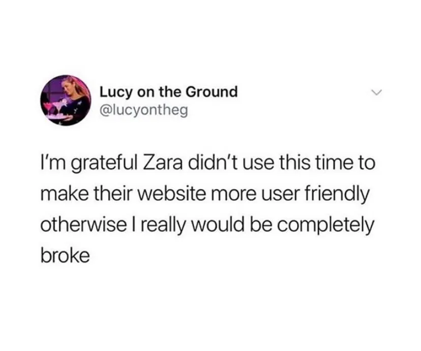
When people go out of their way to joke about your user interface, it's safe to say it's time for a new one.
So I assessed the current site and redesigned it for the moment Zara was in: stores closing during COVID-19 and online sales suddenly carrying the business.
Goals & Objectives
Research and redesign a responsive website for Zara that is tailored to both first-time customers and recurring customers while keeping Zara's current branding.
Design Process
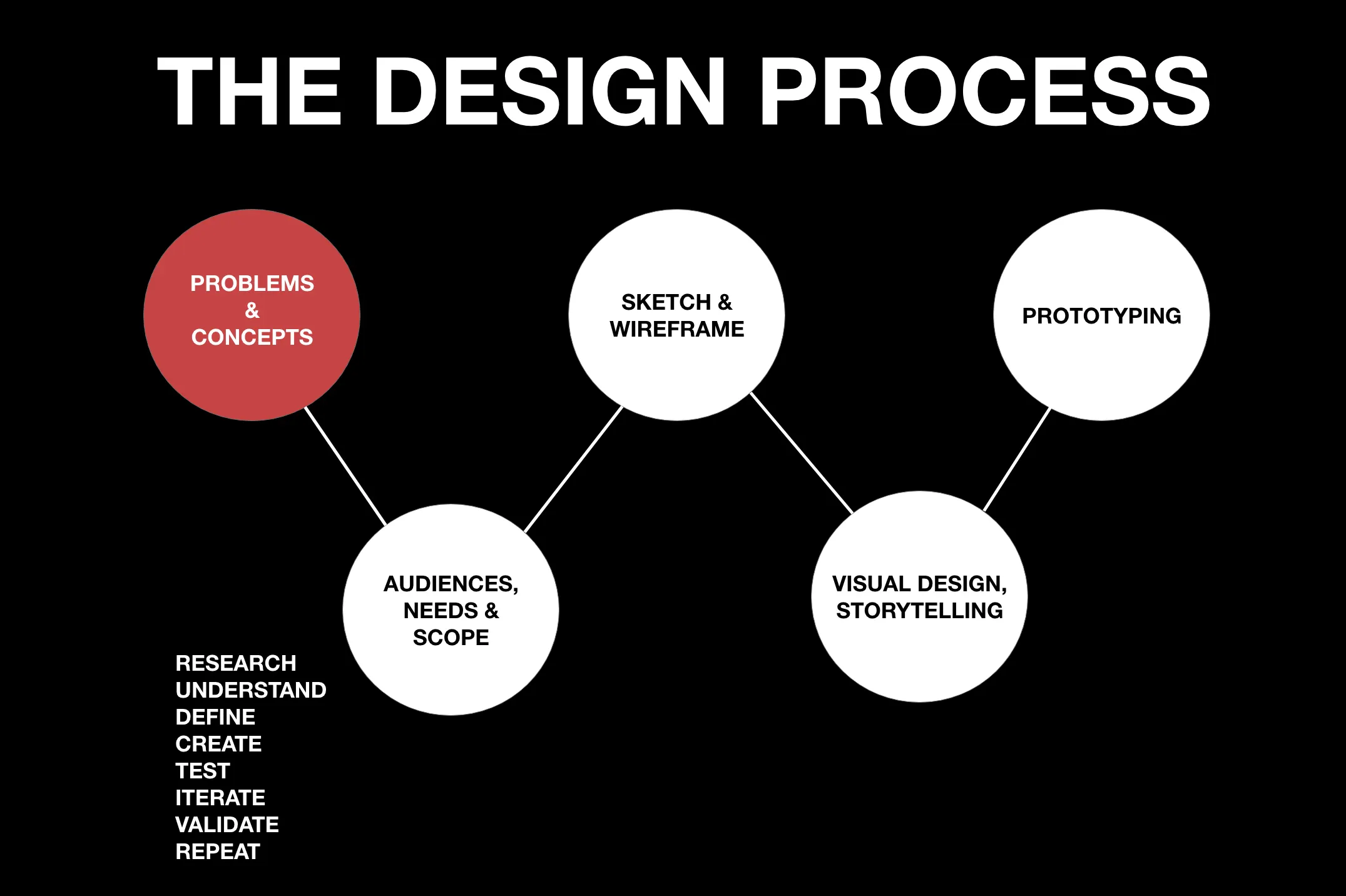
Before sketching anything, I needed to know what new and recurring customers actually run into on Zara.com: their goals, needs, motivations, and frustrations with the online shopping experience.
Research Plan
I started with a research plan to keep the work organized and the timeline honest. The plan: one-on-one interviews and a survey with current and first-time Zara shoppers to find the patterns in their experience, plus a competitor review to see what those sites do right and, more usefully, what they do wrong, so this redesign wouldn't repeat anyone's mistakes.
1-1 Interviews, Survey
21 Total (9 Men, 12 Women)
18-30 years old (Millennials and Gen Z)
The answers were blunt. Only 8 of 21 participants found the site easy to use, and 13 of 21 had already left to shop somewhere else because of it.
Interviews & Survey
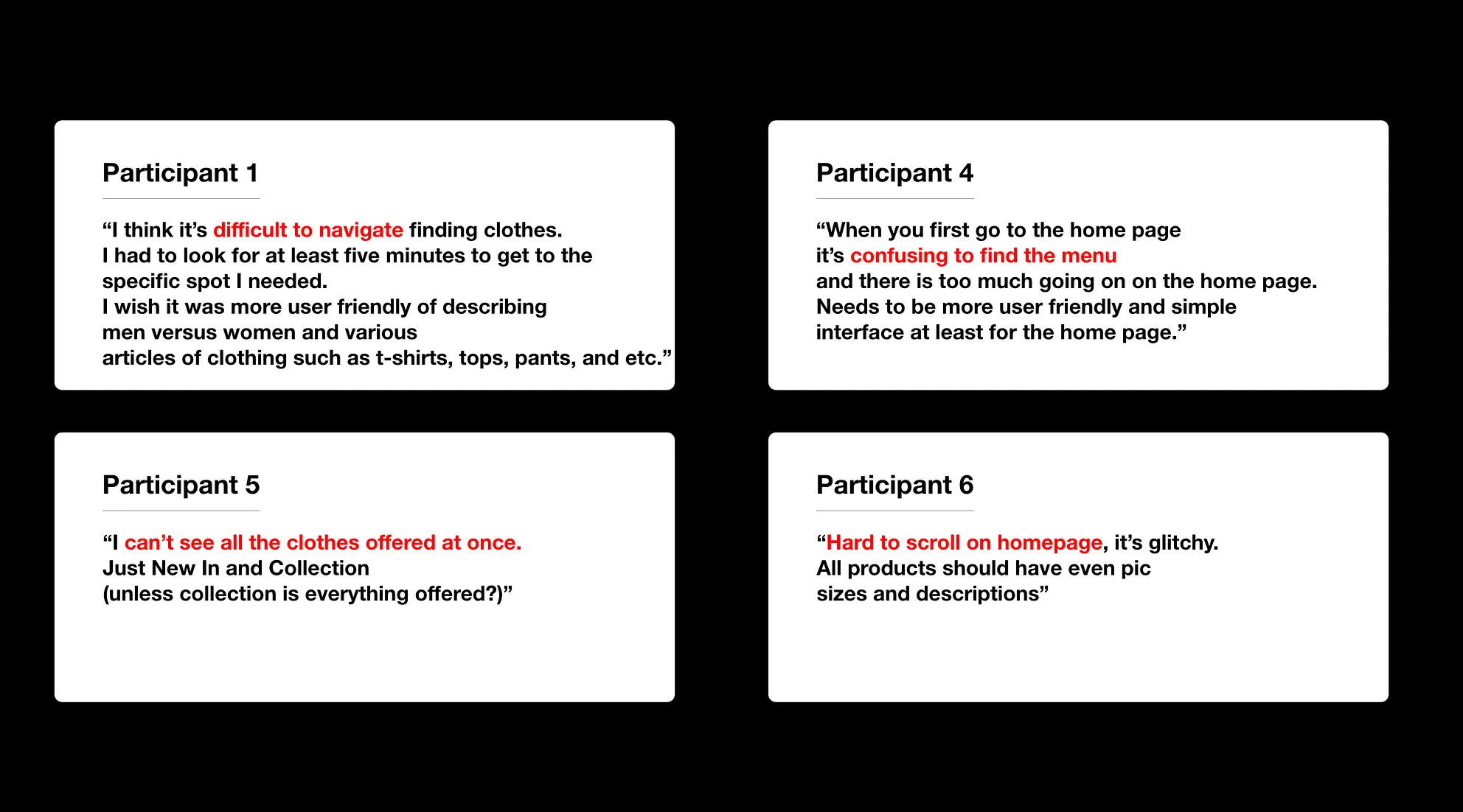
Participant quotes describing what they believe is difficult using Zara's current website
3/21 participants like Zara's current website.
8/21 participants believe Zara's current website is easy to use.
13/21 participants shopped somewhere else because Zara's website is too difficult.
4/21 participants were aware that Zara has a mobile app.
"I can't see all the clothes offered at once" (Participant 5)
Understanding the Product
Before moving onto the sketch & wireframing phase, I wanted to go through Zara's top competitors and analyze the products and services they offer compared to Zara. I also wanted to get a better understanding of Zara's brand so that I can create something that aligns with their style and mission.
Zara opened in the Spanish coastal town of A Coruña in 1975. Its parent company Inditex owns eight brands, runs nearly 7,500 stores, sells in over 200 markets, and is the largest fashion company in the world. Because of COVID-19, Zara plans to close up to 1200 stores and push sales online; Inditex posted a roughly $480M quarterly loss (reported June 2020). With stores closing, the website has to do the selling, so it has to be usable.
Zara's biggest competitors are Uniqlo, Topshop, H&M, ASOS, and Express. Reviewing them, I noticed what sets Zara apart: allure. Zara's core shoppers have modest disposable income but want to be perceived as customers of a top luxury house, the Tom Ford tier. From the dramatic architecture of their stores to the provocative, aspirational imagery of their models, Zara sells a feeling: that you can look and feel desirable without spending thousands. To stay true to that positioning, Zara's interface should carry the same premium, provocative allure as a luxury-fashion site.
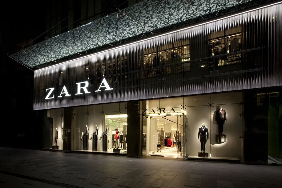
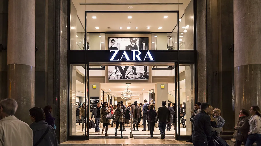
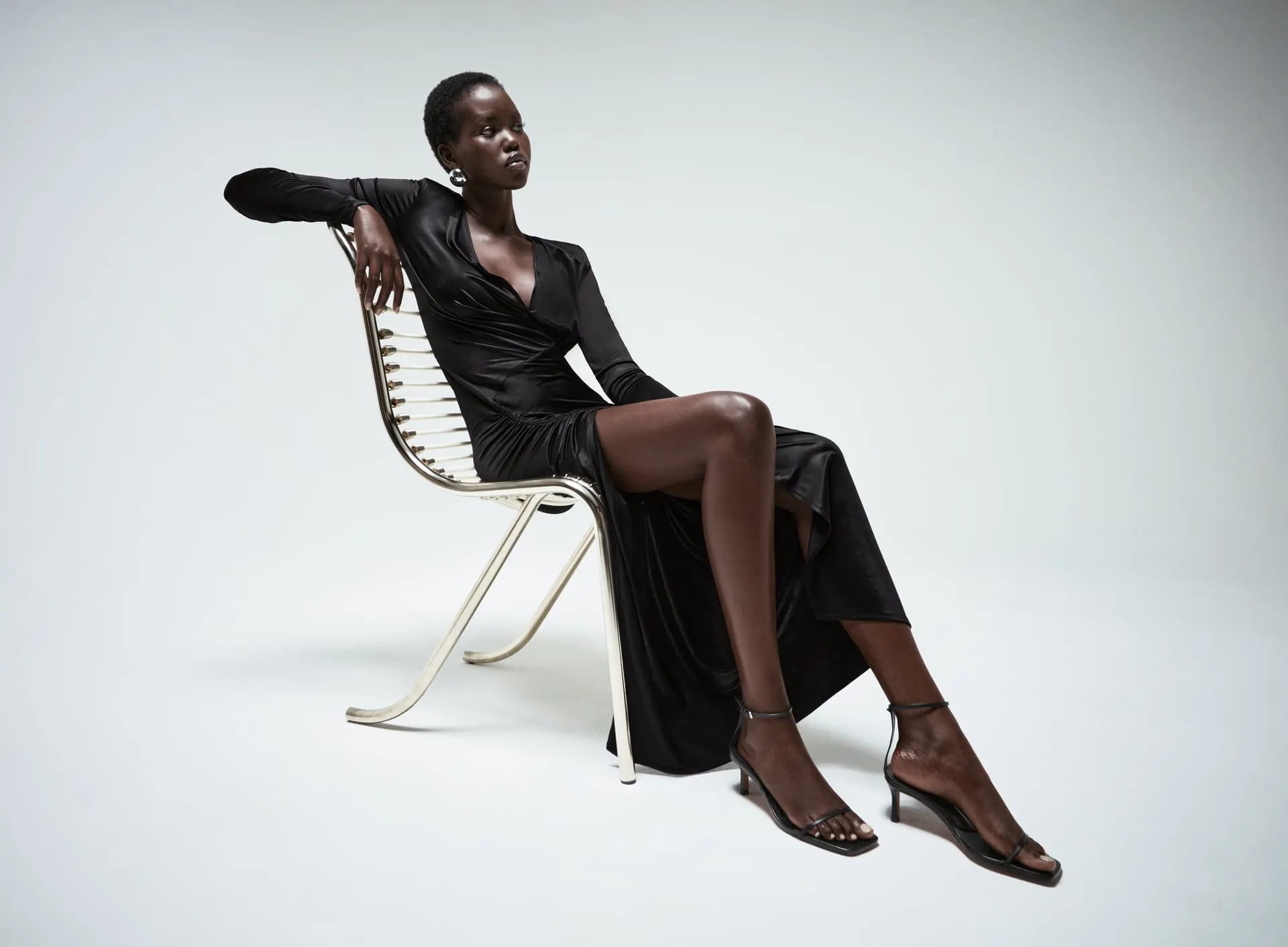
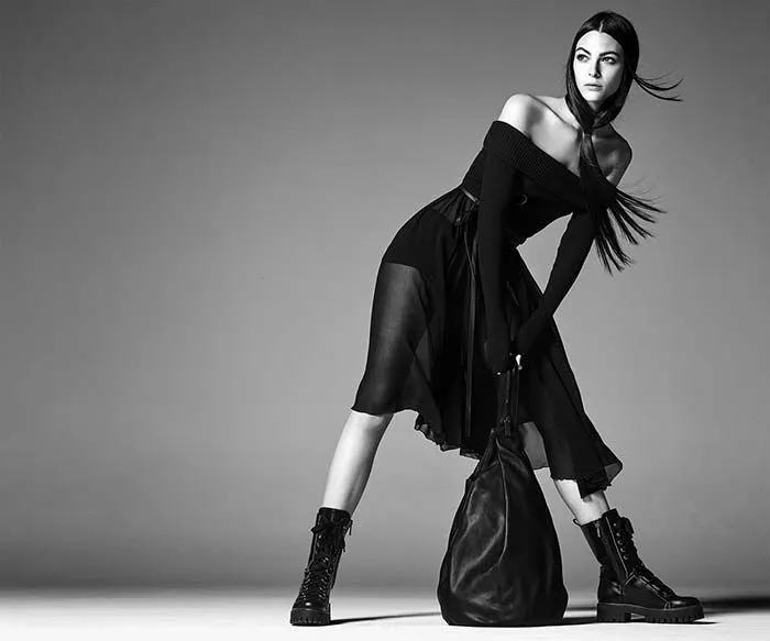
Model Adut Akech (Bottom Left) and Model Grace Elizabeth (Bottom Right)
Understanding the Users
What are the insights I can gather?
My biggest question: was this simply a user interface issue?
I ran a 9-question survey with 21 new and recurring Zara shoppers, all of whom had visited the site within the past 3-4 months. The interviews covered how they make buying decisions online, what they look for in an e-commerce site, and their experience with Zara, all in service of one goal: identify usability issues with the user interface design of the site.
I ran the survey alongside the interviews while each participant navigated the site on a desktop. Once the data was organized, it came down to two main recurring themes:
13 of 21 participants either struggled to navigate Zara's website or found it too busy, and ended up shopping at one of Zara's competitors instead.
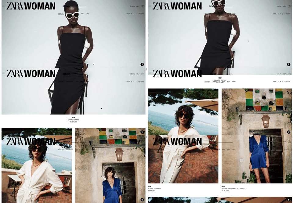
Over half of the participants wanted a simpler interface for navigation, including more pictures of each product without having to scroll up and down.
That led to the question driving the rest of the project:
How can Zara's flagship site mirror the simplicity of its products and its physical stores?
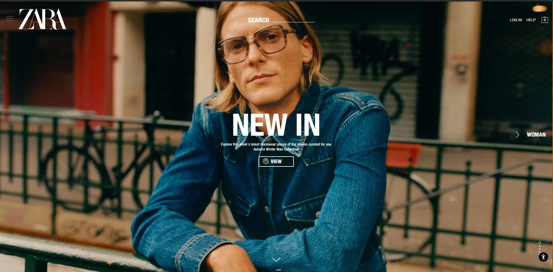
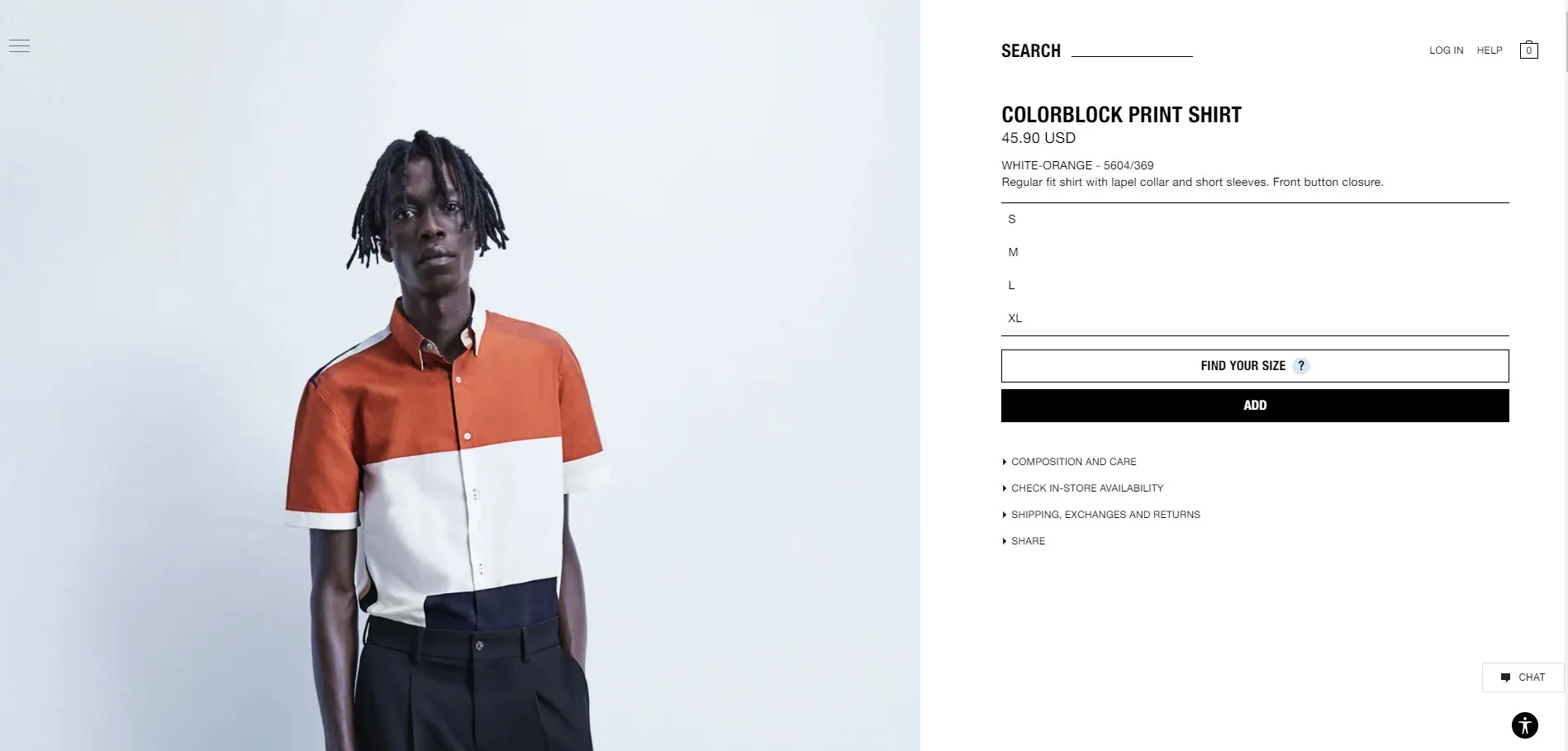
Split images of Zara's home page (Left) and their Mens Shirts page (Right)
The Game Plan
The research pointed at two areas of the site worth fixing.
Each fix answers one of the two recurring themes directly: simpler navigation for efficiency of use, cleaner product pages for the minimalist ask.
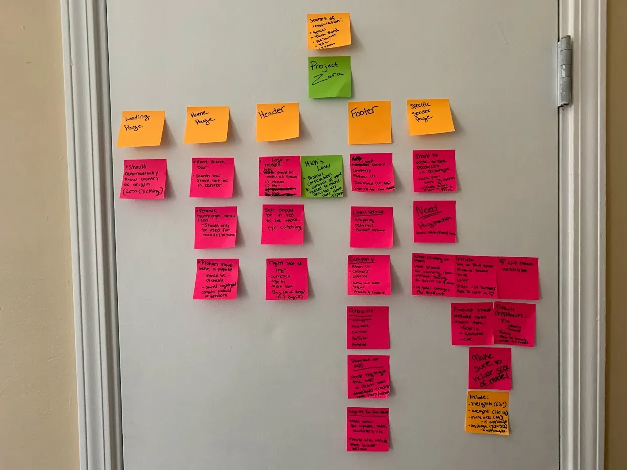
I like to design a website by dividing it into categories and put my thoughts into those categories
Highlighting Issues and Presenting Iterations
After going over several possible solutions, here are some iterations conducted with paper prototyping and Photoshop.
Site Map
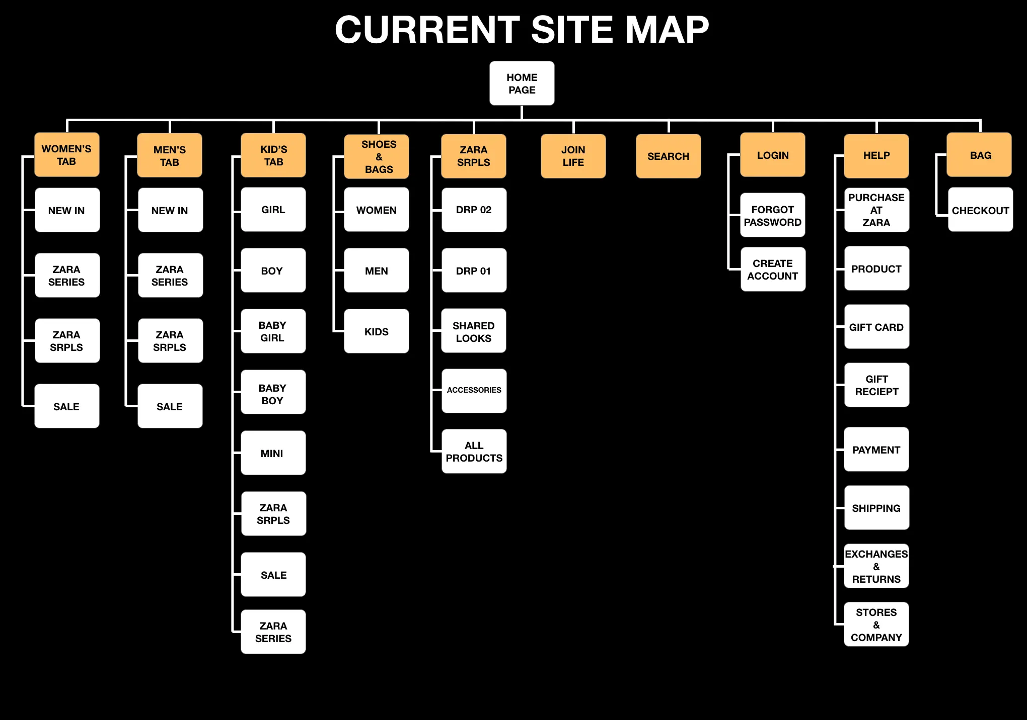
Problems
Too Much
Hick's Law states, "The time it takes to make a decision increases with the number and complexity of choices"
There is an unnecessary amount of choices presented at the top when some of these choices could either be moved to the footer or merged into its own category
Too much clicking is a turnoff for most users
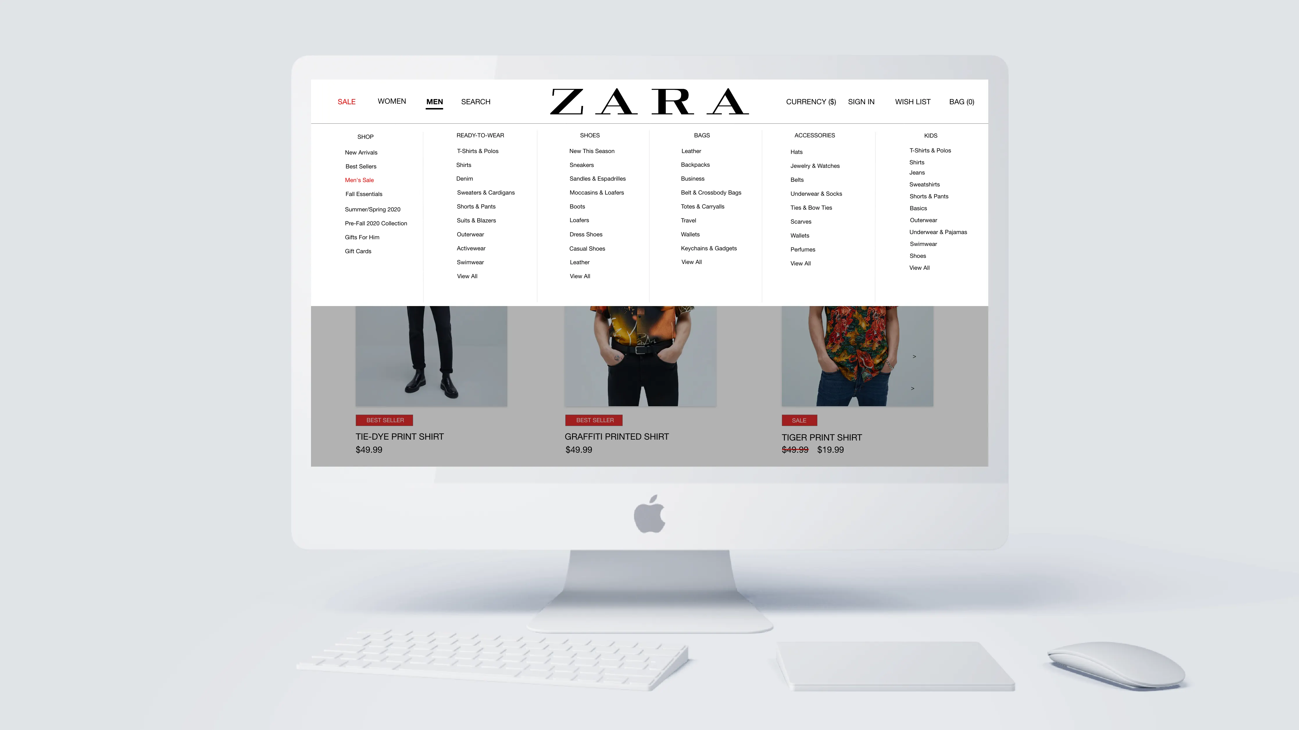
Proposed Site Map
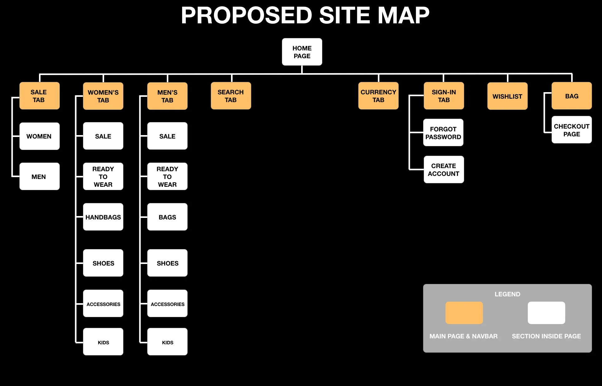
Less is More
To reiterate, Hick's Law states, "The time it takes to make a decision increases with the number and complexity of choices"
Merged "Kids" clothing into the corresponding gender categories
Sale gets its own tab so it is easier to spot
"Ready-To-Wear" instead of "Clothing" borrows the vocabulary of luxury houses, which lends Zara more prestige
Navigation Menu
Current User Interface Home Screen
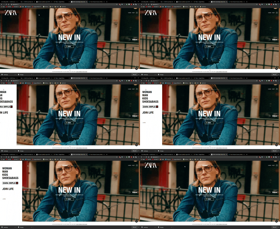
Problems
Not Easily Found
A navigation header should be easily found and not cause any effort or thinking
The coloring blends in with the dark background making it harder to find
38% of people will stop engaging with a website if the content or layout is unattractive, per Adobe research.
Aesthetic Usability Effect states, "Users often perceive aesthetically pleasing design as design that's more usable"
The search bar holds the center of the header, the most prominent slot on the page. My read: that slot belongs to the logo, not the search bar
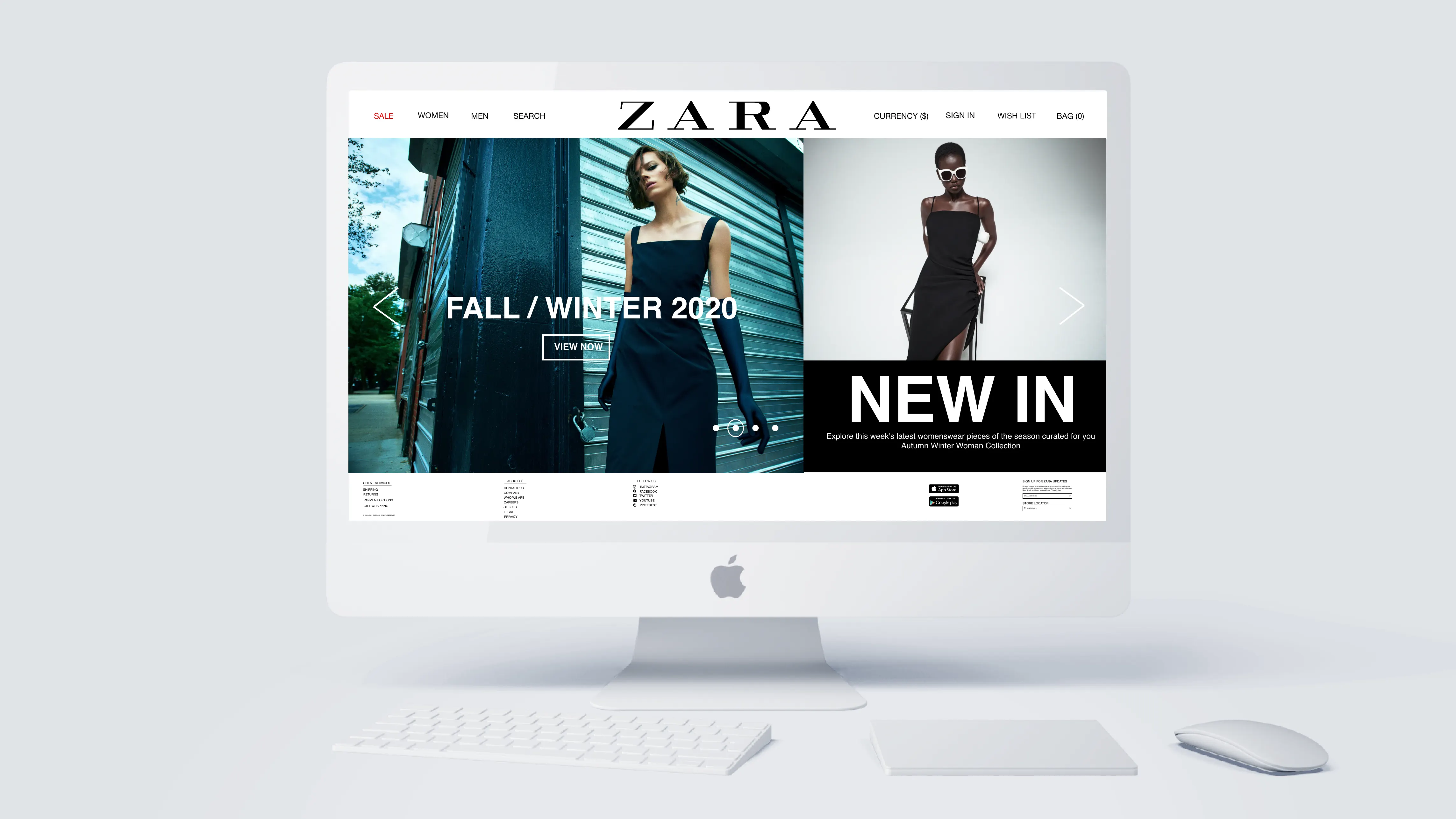
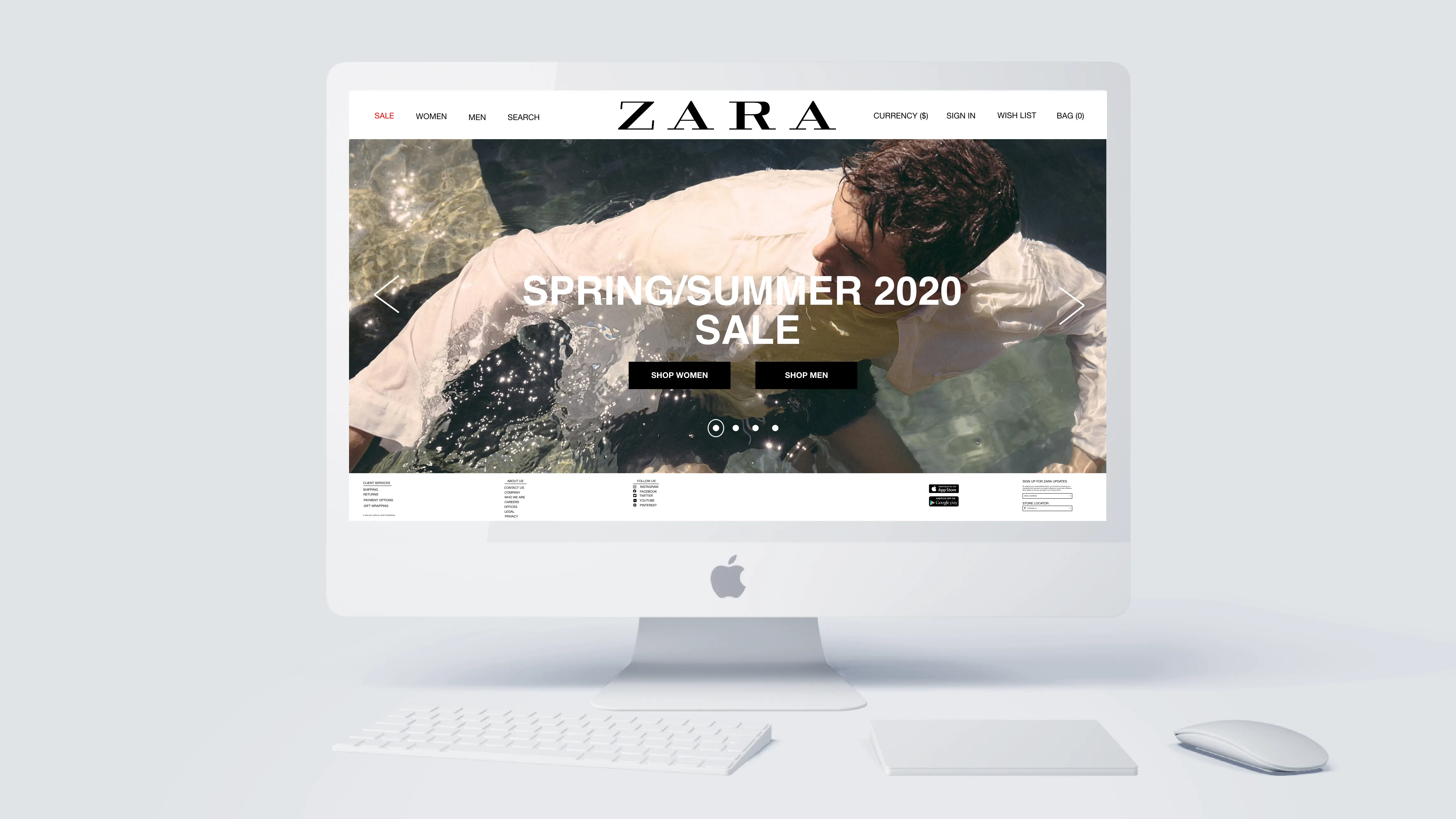
Header & Home Screen Solution Concept
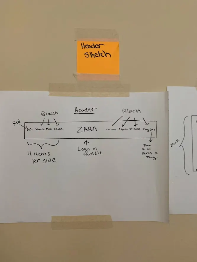
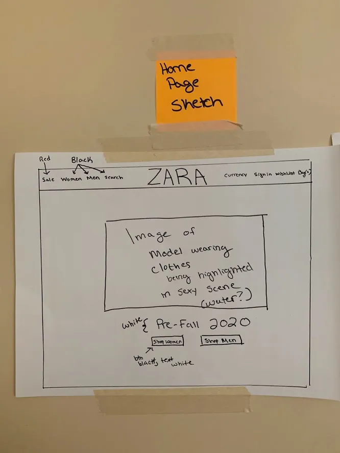
Paper Prototype of Navigation Header (Left) Paper Prototype of Home Screen (Right)
Absolute Simplicity
Navigation bar is visible and easy to find rather than hidden, removing a pain point participants named
Four options per side, borrowing conventions shoppers already know from other retail sites, so nobody has to think about how to navigate
Sale will be in the color red to be more eye-catching
Zara has stores in over 96 different countries and having the ability to change the currency at the top should be a must
Zara's logo takes the center slot, where the search bar used to be
Product Page
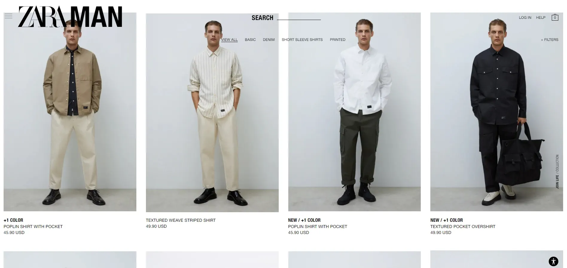
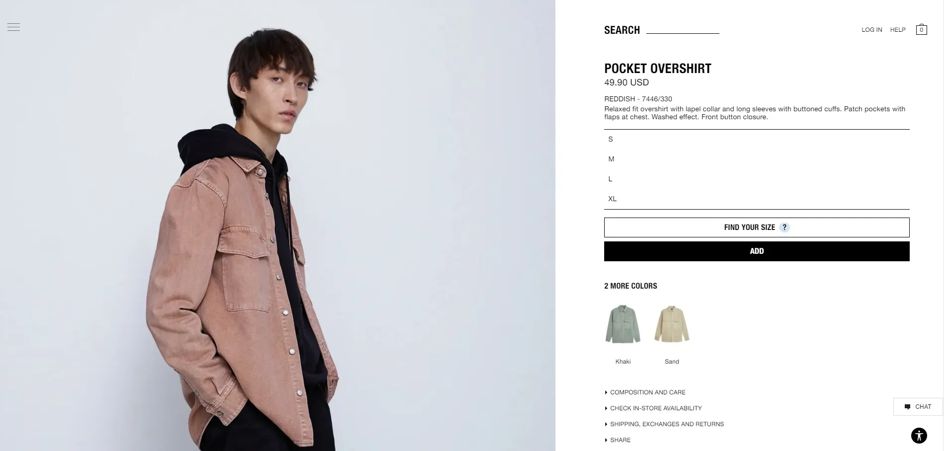
Product Overview Page (Left) Specific Product Page (Right)
Problems
Menu in the middle blends in with pictures of the models
If a product is "New" or a "Best Seller", the coloring should be bright rather than black
The user cannot click through different photos of a product but instead has to click directly on the product to be taken to a separate page and from there view multiple pictures by scrolling up and down
Filters menu is not as easy to identify which can be annoying for the user
Size options run vertically when a single row of buttons would do the same job in less space
The user has to scroll up and down to see the product they selected rather than seeing multiple images at first glance
Color selection sits below the "Add to Cart" button when it should sit above it, before the decision point
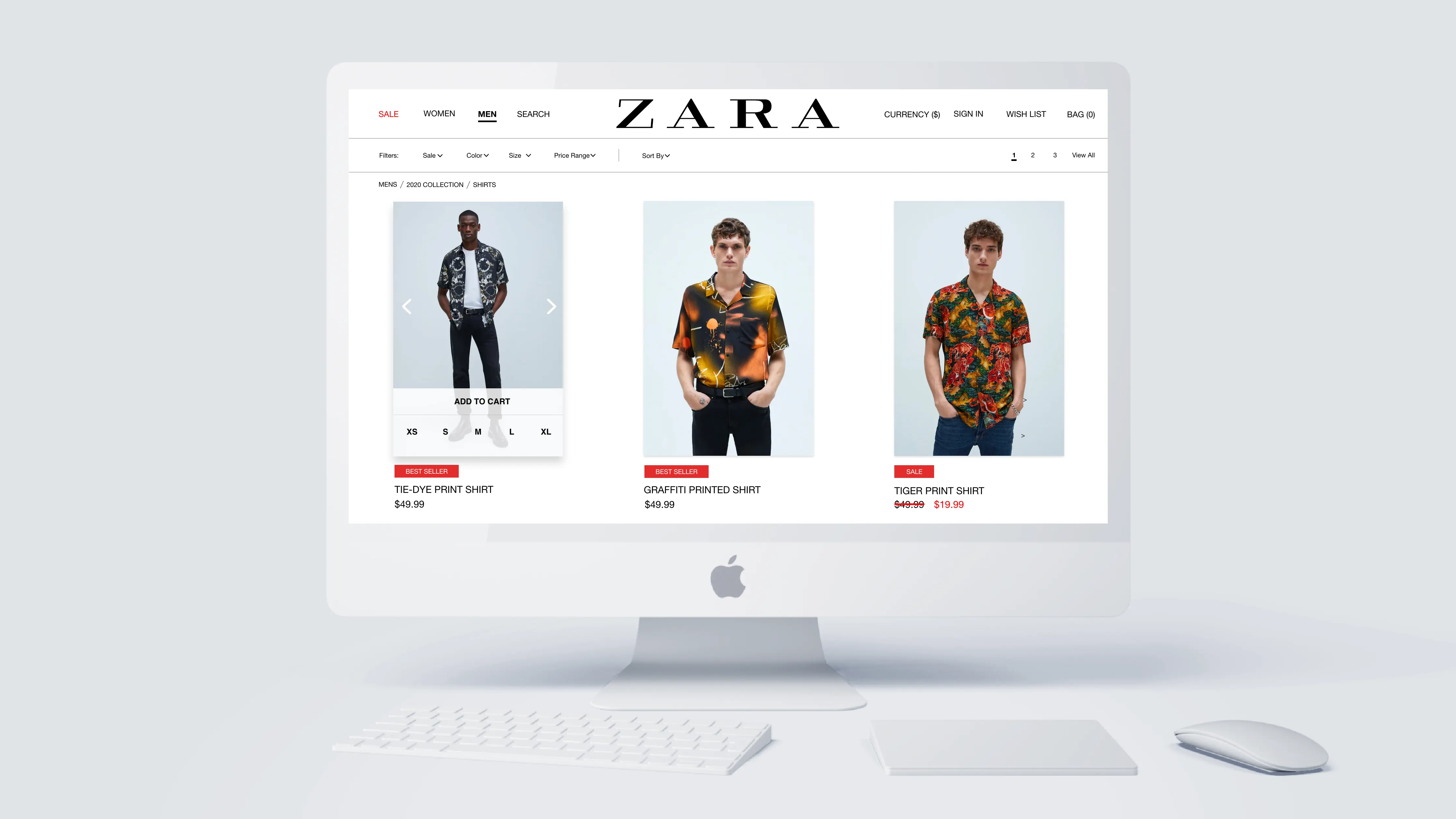
Product Page Solution Concept
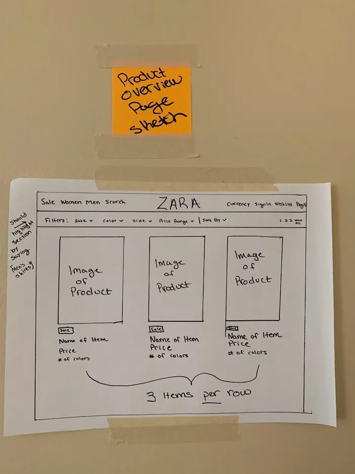
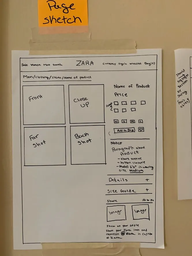
Product Overview Page (Left) Specific Product Page (Right)
Bolder Design
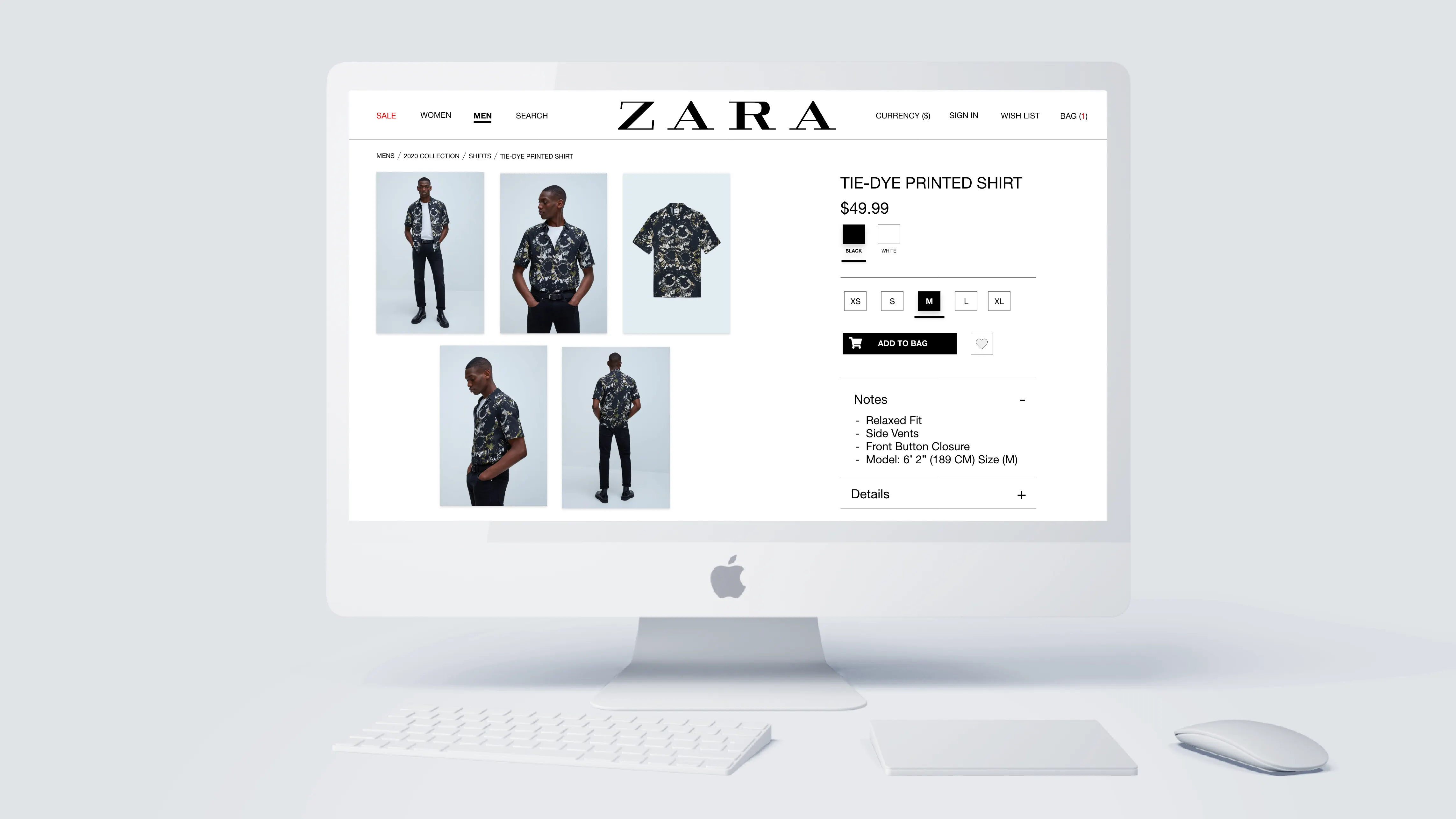
Menu does not blend but is instead easily identifiable and stands out
The filters for a product are easy to identify compared to the current user interface layout
Products that are "New" or a "Best Seller" are labeled inside a red box so they actually stand out
Instead of one large picture and having to scroll up and down to see the model's outfit, the user is presented with 4-5 images that they can click to expand
A breadcrumb trail at the top shows the user the path they took to the current page
Notes dropdown that describes the outfit and gives details about the model and what size they are wearing. E.g. I am 6'1" and I find myself too often buying shirts that are either way too small or too large. Having a reference point of how tall and big a model is can help alleviate a consumer's pain point.
A social campaign that invites customers to share their outfits and spread Zara's name
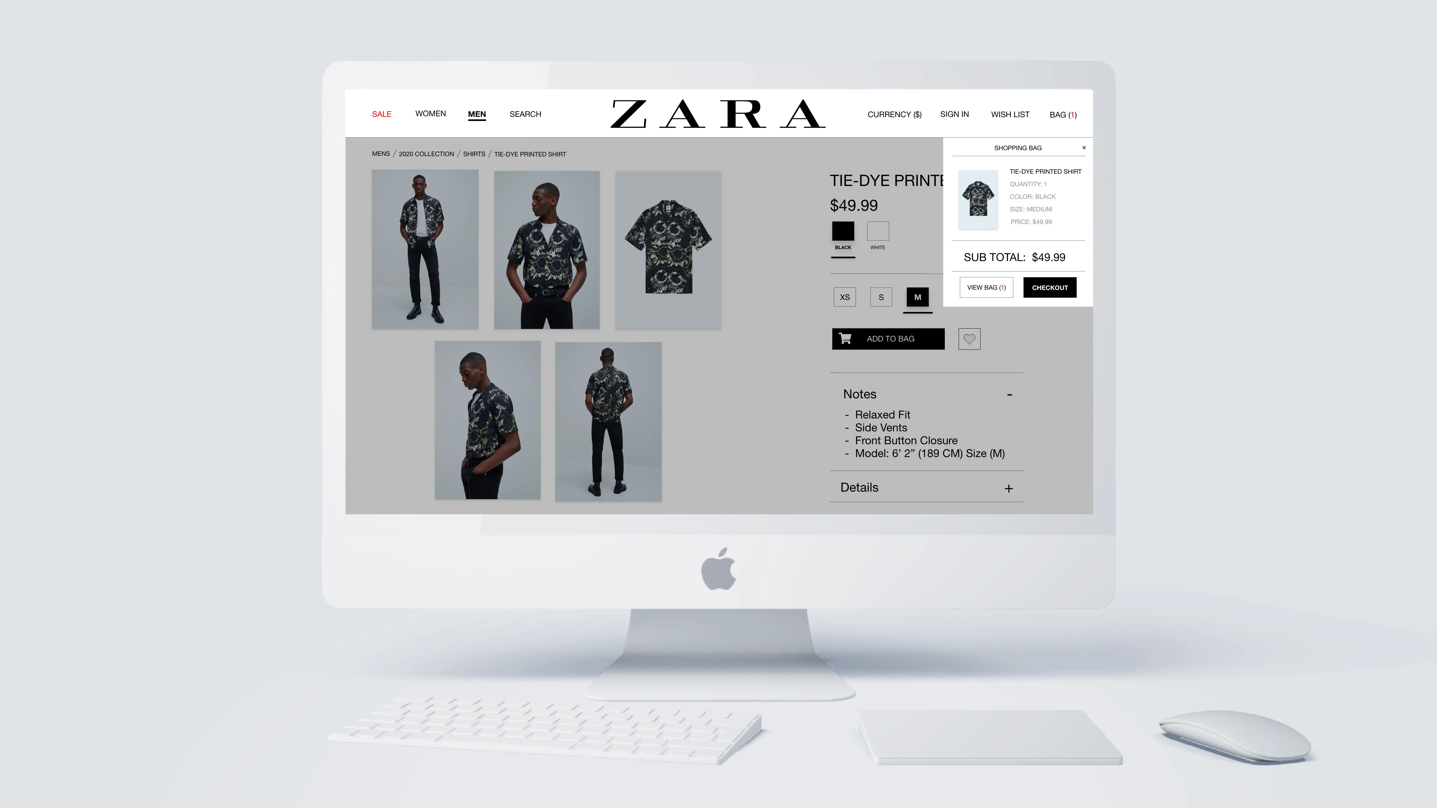
User is presented with an easy sequential process of having to select a size and then color before they can click the button "Add to Cart" compared to the current user interface layout
Final Prototype
Hover over or tap on images to view details
Outcomes & Impact
This is a self-initiated concept, so the outcome is a validated direction rather than a shipped business metric, but the research made both the problem and the fix concrete and measurable.
participants had shopped elsewhere because Zara's site was too hard to use
actually liked the current website, a clear mandate to change it
efficiency of use and cohesive minimalist design, which became the two redesign workstreams
The result is a complete desktop prototype that keeps Zara's brand intact while removing the friction the research surfaced, a concept ready to test head-to-head against the live site. The clear next step is an A/B validation of the new navigation and product-page flows.
Key Decisions & Trade-offs
I kept Zara's identity and only fixed the experience. Less creative latitude, but it respects the brand equity and keeps the proposal realistic rather than a vanity redesign.
Merged categories, gave Sale its own tab, and balanced the nav to four items per side with a centered logo. Fewer top-level choices in exchange for faster, lower-effort decisions.
Leaned on e-commerce patterns shoppers already know rather than novel UI, and used the Aesthetic-Usability Effect so the premium look does real usability work.
Multiple click-to-expand images, horizontal size buttons, and a sequential size → color → add-to-cart path. A more opinionated flow that trades some freedom for fewer mis-purchases.
Moving Forward
This study is not an exhaustive critique of Zara. It is one concrete proposal: a more usable interface for a moment when COVID-19 had closed stores and made the website the main place revenue could come from.
I prototype because a redesign is just an opinion until someone can click through it. And for the record, I shop at Zara and like their clothes; my own experience and the data from 21 shoppers both say the website is the weak link.
The research made the problem concrete: 13 of 21 shoppers had already left for a competitor over usability. The prototype shows a fix that stays inside Zara's brand. The next step is an A/B test of the new navigation and product-page flows against the live site.